15-05-2024, 11:05 AM
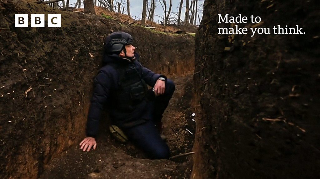
First time I’ve come across this, but the BBC’s news app has a longer article by Laura K, and it’s the first time I’ve seen the bbc in-depth logo. For some reason green is now part of the colour palette. It’s great to see an in-depth article as I’ve always thought the bbc have lack in-depth pieces but the branding is just all over the place.
Why the green? Even the red isnt bbc news red. They’ve gone from a very strong brand to now a very weak one. It’s like they are literally just letting people do whatever.
I’ve also noticed on the homepage of the app this labels. I don’t know what it is but they looks so cheap. I don’t understand why you’d have a red gradient with a red box on top. Then others don’t have the gradient. Either gradient and white box on all or just the red box.
It still can’t get used to this new app. It just feels so much more clunky to use and there is so much more scrolling required to find what you want.
Just a ident loving pres.fan from the East of England
All spelling mistakes are my own #Dyslexic@Keyboard
![[-]](https://pres.cafe/images//collapse.png)