Posts: 6
Threads: 0
Likes Received: 7 in 4 posts
Likes Given: 0
Joined: Nov 2022
Well, there's the removal of the expressive scrolling news ticker from 2013-2023. I said that because every news item would have like 5-7 additional details which can provide proper context on the story. Sort of like a "what we know now" feature.
Now that kind of expressive style remains, but now it's a flipper, and any further detail cannot exceed 100 characters. Seems a backward move to me.
I'm a bit more worried now about their special event graphics, which I've mocked below.
ADMIN EDIT: no mocks on Pres Cafe please, as per our rules.
(This post was last modified: 02-06-2023, 10:50 PM by
Admin PC.)
Posts: 549
Threads: 11
Likes Received: 769 in 320 posts
Likes Given: 352
Joined: Dec 2022
Emotional scenes outside CNN Center today on the channels's anniversary but also the pending departure from its landmark Atlanta headquarters
twitter.com
Posts: 771
Threads: 11
Likes Received: 911 in 566 posts
Likes Given: 554
Joined: Jul 2022
David Leavy, previously from Discovery Inc., is CNN's new COO:
www.hollywoodreporter.com
Watch this space...
WestKnightTV - on DeviantArt
Posts: 337
Threads: 6
Likes Received: 342 in 146 posts
Likes Given: 9,285
Joined: Jul 2022
The new graphics on CNN are not bad.
They do have a more immersive look on the screen when compared to the previous set of graphics launched in 2013.
I do like the red wipe going across the lower thirds when it shows the names of people on the screen. It looks very nice.
The black coloured graphics that are appear on the sides of the screen are very neat.
The name CNN Primetime has appeared in the black tab above the lower thirds as well. The ability to place the CNN name in the black tab is not an issue here.
Posts: 314
Threads: 0
Likes Received: 489 in 215 posts
Likes Given: 402
Joined: Aug 2022
I’ll agree with the sentiment that they aren’t bad. They just aren’t great.
First and foremost, the CNN bug looks cramped. It looks a lot better when LIVE is hidden and CNN is slid down, like before a commercial break or during reruns. It would also be nice if there was a subtle outline or gradient behind the CNN to distinguish the bug box from the headline strap.
Next, the font is just too thin. I checked into a hotel tonight that I’m often at on business. I found it harder to read the TV that always has CNN on in the background that when I was here last.
The show name bug should be the first “tab”. It doesn’t need to slide back and forth. It’s also a shame that these are all the same, rather than using the actual show logo, like the 2012 edition of the graphics.
Lastly, I wouldn’t mind of the gap between the headline strap and the flipper was a red line or if the gap was removed. There needs to be a touch more red on the right side to balance things out. It’s the same with the location/time bubbles at the top of the screen. They should either extend off screen or be curved. As it looks now they just feel chopped off.
I will say I’m getting used to these pretty quickly. The flipper/clock layout makes a lot of sense and there are definitely less characters on screen at any point in time.
Posts: 108
Threads: 1
Likes Received: 255 in 79 posts
Likes Given: 143
Joined: Aug 2022
The graphics are a lateral change. They're so similar to the old ones that I doubt they'll last as long.
The new ad campaign is great. A very crisp and simple way to show CNN at its very best.
Posts: 289
Threads: 0
Likes Received: 434 in 226 posts
Likes Given: 96
Joined: Oct 2022
They looked worse in those shots shown back in May, but they are kind of "eh" to me. I think it was because I was expecting they going to change it wholesale and here it's mostly a few minor changes the 2013 graphics structure is still there, they moved some things around, softened the corners and added multi-tabs. It is a little disappointing that CNN that CNN I doesn't seem to have a different logo signifier that stands out as a visual que that it is CNN International, but I guess because the line up is very simulcast-y there's no point. I still have dropped the ticker or flipper idea completely. I hope there's no annoying boxes that countdown to things or tell me something is on at 9pm as much anymore... please.
Posts: 509
Threads: 9
Likes Received: 739 in 310 posts
Likes Given: 23
Joined: Jul 2022
The graphics are ok, not terrible but no exactly brilliant either. A slight downgrade for me.
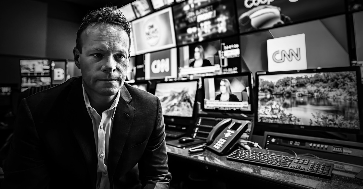
I would recommend this fascinating piece about some of the things going on inside CNN directly by someone who was invited to see the inner workings of the network.
www.theatlantic.com
Posts: 289
Threads: 0
Likes Received: 434 in 226 posts
Likes Given: 96
Joined: Oct 2022
This is good to see, they don't do a box above the logo anymore
twitter.com
Posts: 1,183
Threads: 0
Likes Received: 4,684 in 970 posts
Likes Given: 231
Joined: Aug 2022
Rounded corners, basic gradients, tabs, a touch of drop shadow - somebody has got their hands on the style guide to nearly all early-2000s websites and fed it through PowerPoint.
(This post was last modified: 02-06-2023, 11:24 PM by
DTV.)
![[-]](https://pres.cafe/images//collapse.png)