Posts: 771
Threads: 11
Likes Received: 911 in 566 posts
Likes Given: 554
Joined: Jul 2022
New graphics demo also shown during the WBD Upfront, courtesy of TVNewsTalk (
forums.tvnewstalk.net ).
Since the original captures are Twitter pictures and are quite finicky in embedding, this is a reupload to Metropol
(All rights belong to Warner Bros. Discovery and the original TVNewsTalk user for the captures):
![[Image: TVNewsTalk%20CNN%203.jpg]](https://up.metropol247.co.uk/Knight%20in%20West/TVNewsTalk%20CNN%203.jpg)
![[Image: TVNewsTalk%20CNN%202%203.jpg]](https://up.metropol247.co.uk/Knight%20in%20West/TVNewsTalk%20CNN%202%203.jpg)
Can't really say these are an improvement over the existing ones (and certainly not as good as Licht's analogy implied:
twitter.com ), but hey - at least the compressed headline is gone, for now

Watch this space...
WestKnightTV - on DeviantArt
(This post was last modified: 17-05-2023, 04:42 PM by
W. Knight.)
Posts: 314
Threads: 0
Likes Received: 489 in 215 posts
Likes Given: 402
Joined: Aug 2022
Yikes, those graphics are not it. All of the designs from the CNN+ era and they come up with this uninspired replica that looks like a bad mock of what we have now.
So much for “elegant”…
Posts: 771
Threads: 11
Likes Received: 911 in 566 posts
Likes Given: 554
Joined: Jul 2022
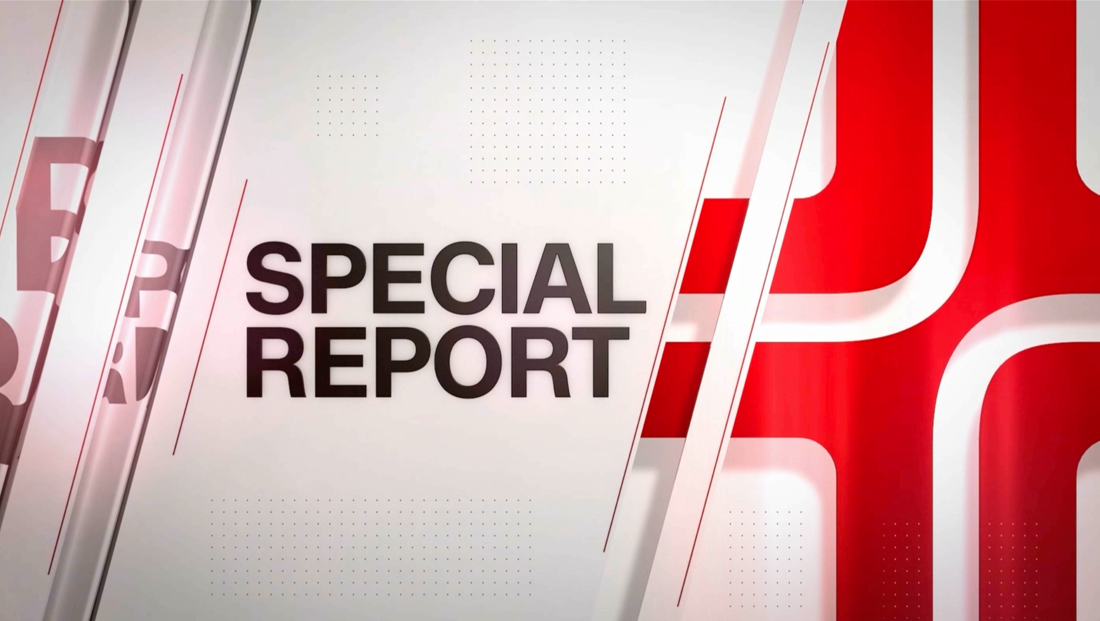
I mean, they have some roots going back to CNN+'s Special Report (note the similarity on the location tag here), but yeah, that isn't as good as they promised to be:
![[Image: cnn-plus-special-report-design-fs.jpg]](https://www.newscaststudio.com/wp-content/uploads/2022/04/cnn-plus-special-report-design-fs.jpg)
(
www.newscaststudio.com )
Watch this space...
WestKnightTV - on DeviantArt
(This post was last modified: 17-05-2023, 05:07 PM by
W. Knight.)
Posts: 550
Threads: 1
Likes Received: 737 in 384 posts
Likes Given: 1,270
Joined: Oct 2022
May as well keep the current graphics! They've aged great. Not sure if these will last almost 10 years like the current set has. Seems like changing for the sake of changing rather than an actual improvement.
(This post was last modified: 17-05-2023, 05:09 PM by
matthieu1221.)
Posts: 94
Threads: 0
Likes Received: 214 in 67 posts
Likes Given: 270
Joined: Oct 2022
Those light typefaces just do not work, it looks cheap and will make the text less legible on mobile devices or at a distance (which is not insignificant for CNN considering the amount of TVs in public spaces they pride themselves on being shown on).
Posts: 647
Threads: 0
Likes Received: 2,384 in 490 posts
Likes Given: 415
Joined: Jul 2022
Looks nice to me. I like the soft edges. Current look is fine and did it's job for the last decade but it was always a bit too large and clunky.
Kaitlan in prime time. Not sure what to make of it. They are desperate for a breakthrough star but I'm not sure she's the one. Cable news ratings are shambles anyway, look at Fox right now. CNN should really just focus on proper news bulletins. Maybe have a News Central in prime time as well. 3 hours of news with Anderson, Erin and someone else. This format seems to be a success, at least contentwise.
(This post was last modified: 17-05-2023, 10:36 PM by
ginnyfan.)
Posts: 49
Threads: 0
Likes Received: 116 in 30 posts
Likes Given: 663
Joined: Jul 2022
Posts: 289
Threads: 0
Likes Received: 434 in 226 posts
Likes Given: 96
Joined: Oct 2022
Those graphics are not elegant. It mostly looks like the current ones but they made them worse. Like how CBS This Morning went from good looking graphics to progressively worse ones.
Posts: 183
Threads: 0
Likes Received: 264 in 114 posts
Likes Given: 20
Joined: Oct 2022
(17-05-2023, 04:40 PM)W. Knight Wrote: New graphics demo also shown during the WBD Upfront, courtesy of TVNewsTalk (forums.tvnewstalk.net ).
Since the original captures are Twitter pictures and are quite finicky in embedding, this is a reupload to Metropol (All rights belong to Warner Bros. Discovery and the original TVNewsTalk user for the captures):
![[Image: TVNewsTalk%20CNN%203.jpg]](https://up.metropol247.co.uk/Knight%20in%20West/TVNewsTalk%20CNN%203.jpg)
![[Image: TVNewsTalk%20CNN%202%203.jpg]](https://up.metropol247.co.uk/Knight%20in%20West/TVNewsTalk%20CNN%202%203.jpg)
Can't really say these are an improvement over the existing ones (and certainly not as good as Licht's analogy implied:
twitter.com ), but hey - at least the compressed headline is gone, for now 
Not a fan of this new look. It’s similar to the current graphics, but worse.
That double tab looks terrible. What I mean is the “CNN THIS MORNING” next to the “BREAKING NEWS.” Those are tabs.
Under the current look there is only a single tab. The show name is under the CNN bug.
It’s not clear to me from those screenshots if that is any easier or harder to read (or about the same). But I fear it will be harder. Certainly doesn’t look easier.
Posts: 10
Threads: 0
Likes Received: 3 in 2 posts
Likes Given: 1
Joined: Oct 2022
They could've just adapted HLN's graphic package. They work for me
![[Image: TVNewsTalk%20CNN%203.jpg]](https://up.metropol247.co.uk/Knight%20in%20West/TVNewsTalk%20CNN%203.jpg)
![[Image: TVNewsTalk%20CNN%202%203.jpg]](https://up.metropol247.co.uk/Knight%20in%20West/TVNewsTalk%20CNN%202%203.jpg)

![[Image: TVNewsTalk%20CNN%203.jpg]](https://up.metropol247.co.uk/Knight%20in%20West/TVNewsTalk%20CNN%203.jpg)
![[Image: TVNewsTalk%20CNN%202%203.jpg]](https://up.metropol247.co.uk/Knight%20in%20West/TVNewsTalk%20CNN%202%203.jpg)


![[-]](https://pres.cafe/images//collapse.png)
![[Image: cnn-plus-special-report-design-fs.jpg]](https://www.newscaststudio.com/wp-content/uploads/2022/04/cnn-plus-special-report-design-fs.jpg)
