Posts: 56
Threads: 0
Likes Received: 105 in 38 posts
Likes Given: 22
Joined: Jul 2022
(26-08-2022, 11:03 PM)RtH Wrote: The Dutch public broadcaster KRO-NCRV will introduce a new logo next Monday. The current logo has been in use since 2014, the year when KRO and NCRV merged.
Image
And a preview of two of the idents that will be shown at the end of the programme.
youtu.be
I like it. It's unconventional and feels quite retro. I also feel that it takes after HUMAN's design.
(26-08-2022, 04:17 PM)AxG Wrote: (26-08-2022, 02:50 PM)ConorM98 Wrote: Flemish broadcaster VRT is introducing a new corporate logo this Autumn as part of a rebrand of their streaming service VRT NU into VRT Max. VRT NWS, their news brand is also getting the new look.
Their TV and radio brands are staying the same.
Also Canvas will now start earlier from 5pm this Autumn and Radio 2 is also doing a new breakfast show which is going to be a national show instead of separate regional shows.
VRT Max launches on Monday, VRT NWS' new look programmes with the new logo will launch on September 1st.
www.youtube.com
Their old (although still current logo) isn't all that old, having been adopted in 2017, the logo before that was used for 16 years.
Speaking of Belgian change, how about the RTBF? They haven't changed their logo in forever!
(This post was last modified: 27-08-2022, 01:26 AM by
Radiounion.)
Posts: 34
Threads: 0
Likes Received: 29 in 13 posts
Likes Given: 22
Joined: Jul 2022
VRT's new logo is live all over the corporation.
Just spotted an Één ident that now ends with the VRT logo at the end.
The same would probably be used for Canvas.
Posts: 6
Threads: 0
Likes Received: 9 in 4 posts
Likes Given: 1
Joined: Jul 2022
It's a well executed rebrand by VRT. I really like the font they have chosen. Even VRT Journaal is going to use it apparently.

Posts: 838
Threads: 11
Likes Received: 1,011 in 603 posts
Likes Given: 587
Joined: Jul 2022
(29-08-2022, 12:32 PM)ConorM98 Wrote: VRT's new logo is live all over the corporation.
Just spotted an Één ident that now ends with the VRT logo at the end.
The same would probably be used for Canvas.
Indeed it is:
youtu.be
(26-08-2022, 11:03 PM)RtH Wrote: The Dutch public broadcaster KRO-NCRV will introduce a new logo next Monday. The current logo has been in use since 2014, the year when KRO and NCRV merged.
And now the rebrand is up, as seen from their webpage. Interestingly, the rebrand seems to bring a standardized layout to the programme logos, as the dartboard symbol is used in different colour combinations.
For instance, Kindertijd, their preschool kids show, looks like this:
![[Image: jNS-ntBhNYpkNiZMXUx3ESDWPSFevAL8mEHOIqvT...f-no-nd-rj]](https://yt3.ggpht.com/jNS-ntBhNYpkNiZMXUx3ESDWPSFevAL8mEHOIqvTGapIH7M-gYR9iW8m0bgVaP9F9FW6nryMp2g=w1060-fcrop64=1,00005a57ffffa5a8-k-c0xffffffff-no-nd-rj)
Watch this space...
WestKnightTV - on DeviantArt
(This post was last modified: 13-12-2022, 11:16 AM by
W. Knight.)
Posts: 34
Threads: 0
Likes Received: 29 in 13 posts
Likes Given: 22
Joined: Jul 2022
SAT.1 as of 1st September has had a redesign, keeping their current logo but now having the famous ball change and adapt into different settings in the idents and breakbumpers.
There's also a new slogan for the channel, "Es gibt noch viel zu sehen" which translates as "There's still a lot to see".
vimeo.com
Posts: 838
Threads: 11
Likes Received: 1,011 in 603 posts
Likes Given: 587
Joined: Jul 2022
Staying in Europe, RTVS 3 in Slovakia was replaced by rolling news under the Ukraine War, and returned in June after 24 became a separate channel:
youtu.be
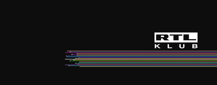
Also, big changes to RTL in Hungary, as RTL Klub will be unified as simply RTL by the end of October:
company.rtl.com
Other channels will be renamed as well, as RTL II is set to become RTL Kettő, and RTL+ (not to be confused with their new streaming platform) will be RTL Három.
satkurier.pl
Over in South America, Canal 10, the América TV affiliate in Junín, Argentina, relaunched as Canal Diez in March.
This coincided with the start of HD broadcast from the station, and shared the same symbol with Australia's Network 10:
youtu.be
Watch this space...
WestKnightTV - on DeviantArt
(This post was last modified: 22-12-2022, 05:21 PM by
W. Knight.
Edit Reason: Replacing dead video link.
)
Posts: 838
Threads: 11
Likes Received: 1,011 in 603 posts
Likes Given: 587
Joined: Jul 2022
TVB Finance, Sports and Information Channel, Hong Kong, 5/9/2022. Following the shift of racing and lottery rights from their sibling J2 (DTT Ch. 82) to Ch. 85, the channel relaunched to show its new focus on sport.
The full ident, whose typeface broke free from the 2017 rebrand with TVB News:
youtu.be
Hexagons are a main part in this new identity, as seen from their junction and holding slide:
youtu.be
... Parental Guidence and Indirect Advertising captions...
youtu.be
... promo endboards...
youtu.be
... and primetime programme menu.
youtu.be
Watch this space...
WestKnightTV - on DeviantArt
Posts: 221
Threads: 0
Likes Received: 383 in 124 posts
Likes Given: 641
Joined: Sep 2022
(12-09-2022, 09:31 AM)W. Knight Wrote: TVB Finance, Sports and Information Channel, Hong Kong, 5/9/2022. Following the shift of racing and lottery rights from their sibling J2 (DTT Ch. 82) to Ch. 85, the channel relaunched to show its new focus on sport.
The full ident, whose typeface broke free from the 2017 rebrand with TVB News:
youtu.be
Hexagons are a main part in this new identity, as seen from their junction and holding slide:
youtu.be
... Parental Guidence and Indirect Advertising captions...
youtu.be
... promo endboards...
youtu.be
... and primetime programme menu.
youtu.be
Previously HK’s Ch 85 had four names - High Definition Jade, J5, TVB Finance Channel, TVB Finance & Information Channel… So last week they got a much longer name.
Have to say TVB’s presentation is far awful than before. Full of inconsistency, lacking of cooperation-wide branding, and default fonts from Microsoft Windows.
(This post was last modified: 12-09-2022, 10:34 AM by
Frances.)
Posts: 838
Threads: 11
Likes Received: 1,011 in 603 posts
Likes Given: 587
Joined: Jul 2022
(12-09-2022, 10:33 AM)Frances Wrote: Previously HK’s Ch 85 had four names - High Definition Jade, J5, TVB Finance Channel, TVB Finance & Information Channel… So last week they got a much longer name.
Have to say TVB’s presentation is far awful than before. Full of inconsistency, lacking of cooperation-wide branding, and default fonts from Microsoft Windows.
Yeah, it's a mouthful. J5 would have been a nice name, if it wasn't connotated to "newscasts with Simplified Chinese subtitles".
On consistent branding - I agree, they've done a better job in the past:
[*]The caligraphic style Pearl wordmark was accompanied by one on Jade around the 90s. See the Jade DOG in the 1994 singing contest:
youtu.be
[*]Versus the Pearl documentary promo in Chinese:
youtu.be
[*]J5 used the same naming scheme and font as J2's;
[*]HD Jade and TVB iNews had the same thin font;
[*]Then TVB News and TVB Finance Channel had the same naming structure and font.
Jade first broke the ranks with a more legible and angular font in their DOG, then J2 completely abandoned the corporate symbol for an elephant trunk, and now Ch.85 is changing to a font that makes no sense in Chinese stroke order. But then again, it's TVB, you don't expect the best out of them.
Watch this space...
WestKnightTV - on DeviantArt
(This post was last modified: 13-09-2022, 07:59 AM by
W. Knight.)
Posts: 838
Threads: 11
Likes Received: 1,011 in 603 posts
Likes Given: 587
Joined: Jul 2022
Freeform launched a new symbol during their 31 Nights of Halloween strand promo in early September:
youtu.be
Also in the new season is Greek public broadcaster EPT, who launched a new set of idents on their channels:
www.youtube.com
www.youtube.com
www.youtube.com
www.youtube.com
Over in the Philippines, after 2 years of vacancy, AllTV launched today on ABS-CBN's former Channel 2 spot. This is their ident/station jingle:
youtu.be
Looking at their press releases, they have quite an arsenal of talents: Former ABS-CBN journalist Anthony Taberna, singer and actress Ciara Sotto, actress Toni Gonzaga and her filmmaker husband Paul Soriano. They also collaborated with CNN Philppines, who will produce an hour-long news show for the station and simulcast their 6pm newscast.
Watch this space...
WestKnightTV - on DeviantArt
(This post was last modified: 09-11-2022, 04:55 AM by
W. Knight.
Edit Reason: Replacing original links from a terminated channel.
)

![[-]](https://pres.cafe/images//collapse.png)
