Posts: 572
Threads: 3
Likes Received: 604 in 310 posts
Likes Given: 62
Joined: Oct 2022
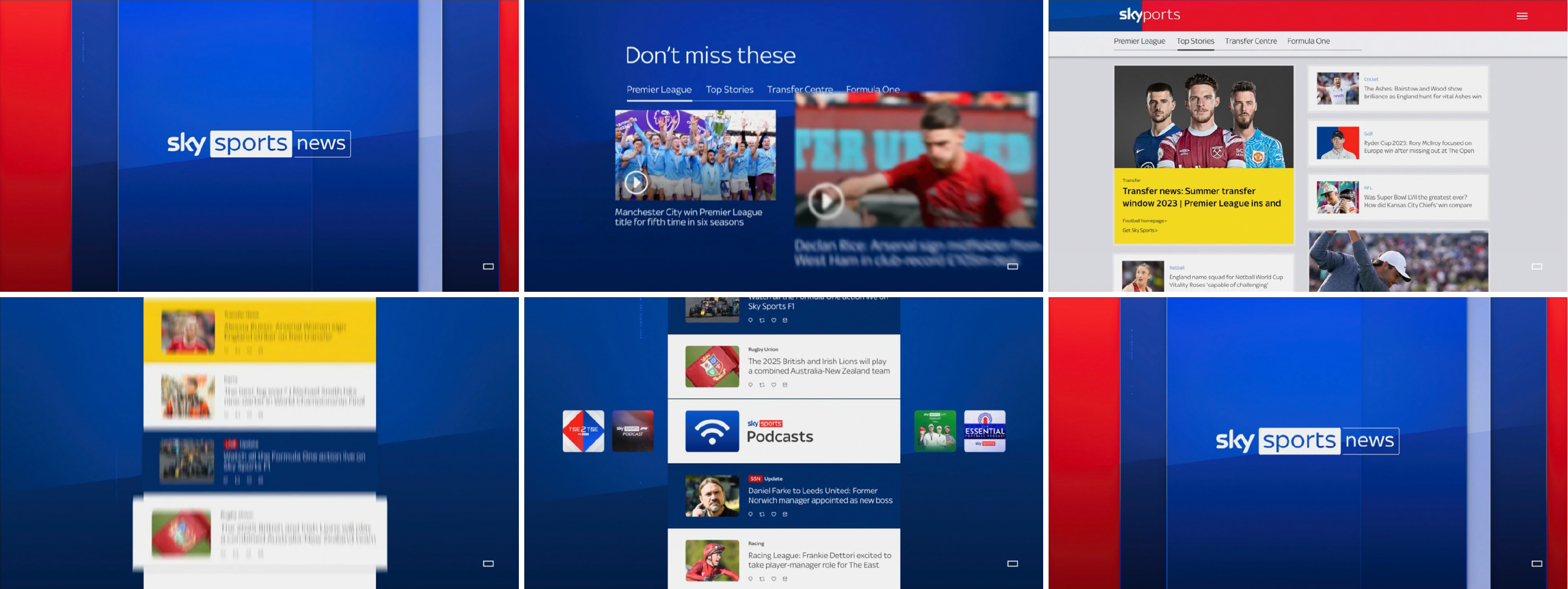
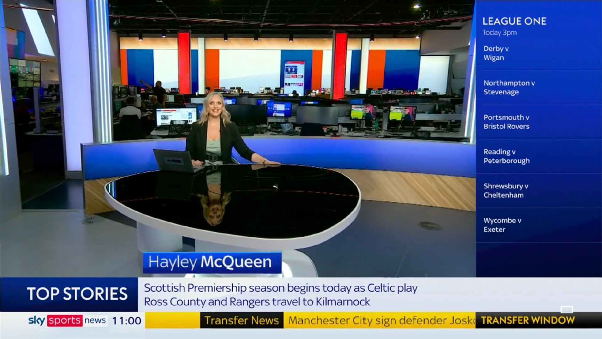
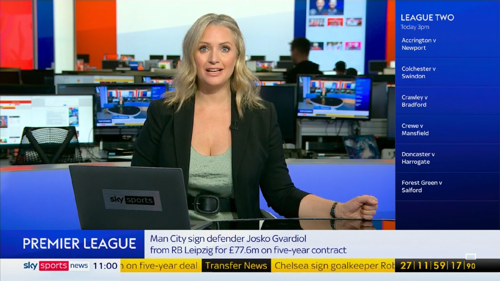
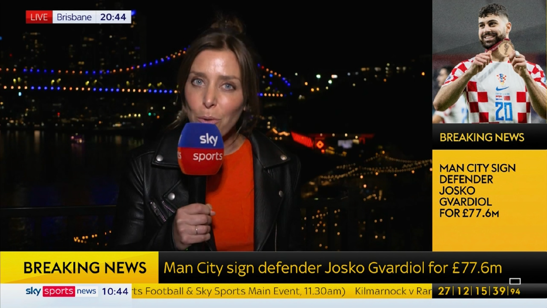
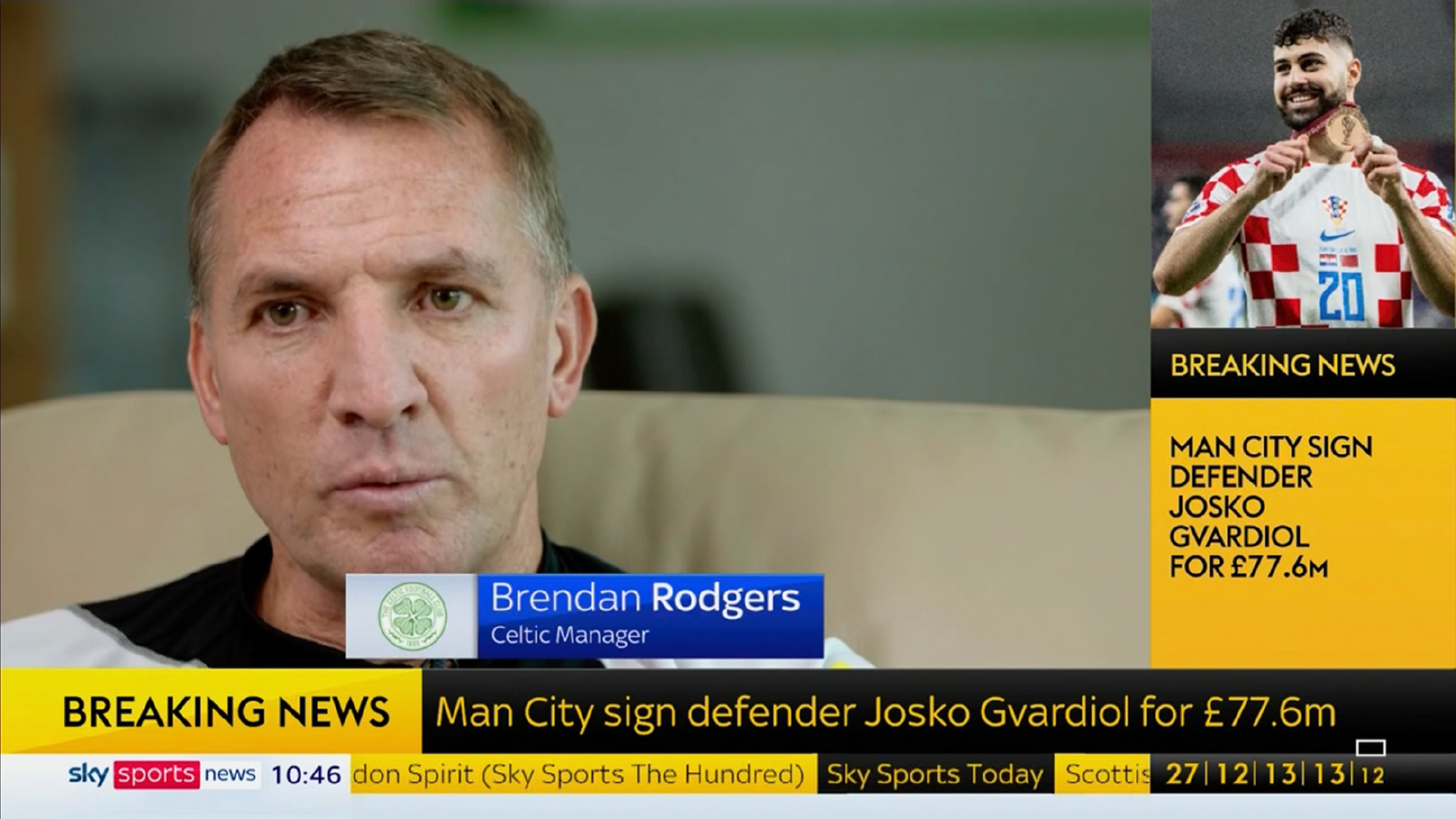
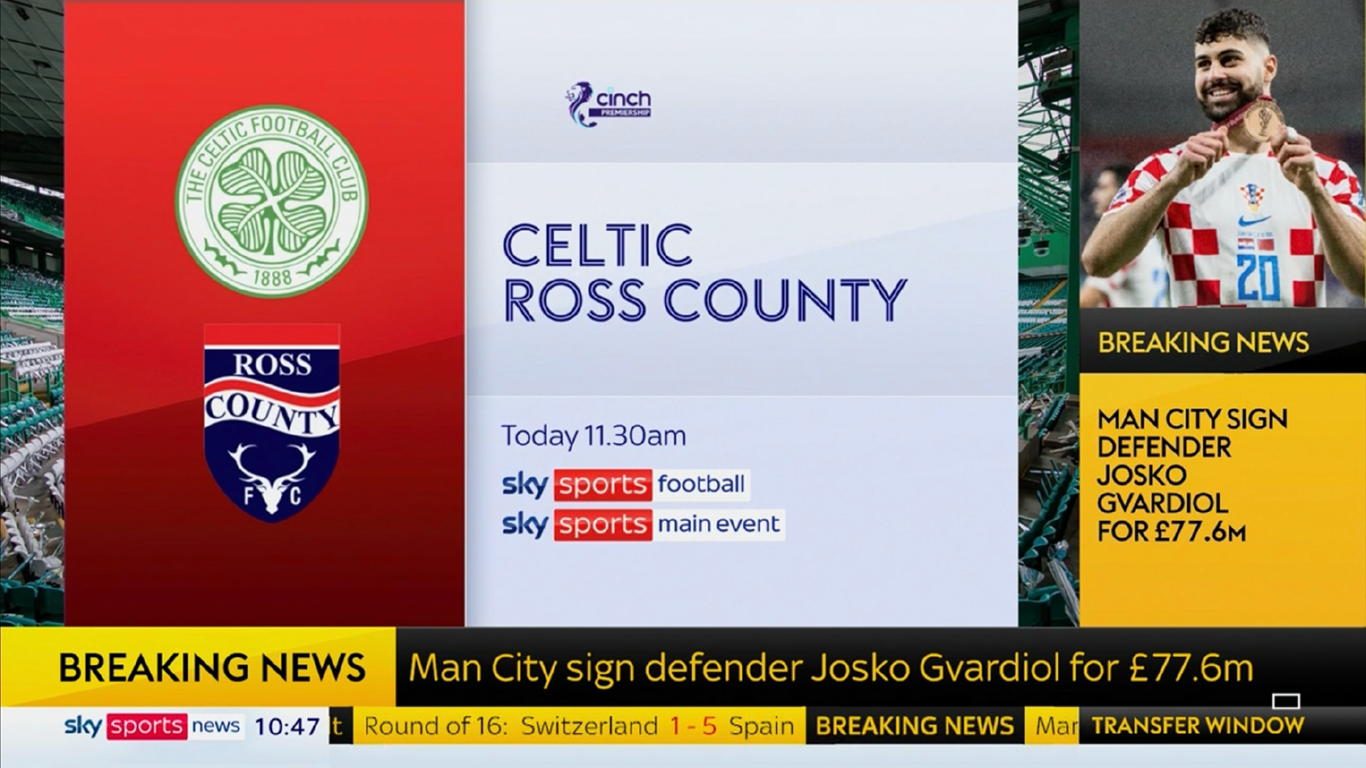
New look Sky Sports News on air and the Sky News inspiration is clear from the off - DOG and clock moved to the bottom left, where they are on Sky News. What are lower thirds on Sky News is the bottom of the reverse L-bar, with Sky Sports News keeping its own style lower thirds (they animate differently now though). It looks a lot cleaner I have to say. The music, which is now ten years old and lasted through several rebrands, has been kept, and is back on Good Morning Sports Fans which had its own theme for a while.
Posts: 19
Threads: 0
Likes Received: 71 in 14 posts
Likes Given: 15
Joined: Jul 2022
(05-08-2023, 07:57 AM)Rdd Wrote: New look Sky Sports News on air and the Sky News inspiration is clear from the off - DOG and clock moved to the bottom left, where they are on Sky News. What are lower thirds on Sky News is the bottom of the reverse L-bar, with Sky Sports News keeping its own style lower thirds (they animate differently now though). It looks a lot cleaner I have to say. The music, which is now ten years old and lasted through several rebrands, has been kept, and is back on Good Morning Sports Fans which had its own theme for a while.
The music has been remixed.
Posts: 49
Threads: 0
Likes Received: 167 in 38 posts
Likes Given: 28
Joined: Sep 2022
It's a shame that the titles on SSN have followed the Sky news format of just animating links from the website and app... It's just a bit lame.
Was hoping that Sky News itself would see sense and return to having a proper opener sooner rather than later, but sadly this fad doesn't seem to have ended yet at Sky.
Posts: 3,612
Threads: 17
Likes Received: 5,841 in 1,902 posts
Likes Given: 2,634
Joined: Jul 2022
Not seen any of it yet but taking inspiration from Sky News sounds like a downgrade - Sky Sports News has almost always looked better and if anything News channels could learn alot from them.
Posts: 164
Threads: 6
Likes Received: 488 in 111 posts
Likes Given: 7
Joined: Jul 2022
Posts: 49
Threads: 0
Likes Received: 167 in 38 posts
Likes Given: 28
Joined: Sep 2022
(05-08-2023, 11:12 AM)Brekkie Wrote: Not seen any of it yet but taking inspiration from Sky News sounds like a downgrade - Sky Sports News has almost always looked better and if anything News channels could learn alot from them.
The graphics actually look really nice. They're clean, legible, slick.
Problem for me is that they've made them less useful.
I was watching for a little while this morning and for most of that time the same headline was on the bottom of the L bar and the side.
Exact same text, just in sentence case on the bottom and uppercase on the right.
Only criticism on the actual look would be the sheer number of different fonts on screen at the same time.
Sky Text on the ticker, a different pointier version on breaking news, the individual sports having their own font. Bit messy.
Posts: 62
Threads: 1
Likes Received: 256 in 44 posts
Likes Given: 59
Joined: Jul 2022
(05-08-2023, 11:12 AM)PATV Scunthorpe Wrote: ![[Image: SSN2023Stills-02.png]](https://up.metropol247.co.uk/PATV%20Scunthorpe/SSN2023Stills-02.png)
Well, I never thought I’d see the day! It appears that someone has seen an old clip of when BBC World were in N9 and gone “that’s a great idea for a desk…”
(This post was last modified: 05-08-2023, 11:46 AM by
Critique.)
Posts: 231
Threads: 2
Likes Received: 453 in 138 posts
Likes Given: 1,374
Joined: Jul 2022
(05-08-2023, 11:45 AM)Critique Wrote: Well, I never thought I’d see the day! It appears that someone has seen an old clip of when BBC World were in N9 and gone “that’s a great idea for a desk…”
Is that the old space for Sky News Sunrise?
Posts: 36
Threads: 0
Likes Received: 60 in 21 posts
Likes Given: 8
Joined: Jul 2022
Seems like it's a big ol' overhaul at Sky Sports News. Also some additional imagery and a preview of Soccer Saturday's look.
www.tvbeurope.com
Posts: 164
Threads: 6
Likes Received: 488 in 111 posts
Likes Given: 7
Joined: Jul 2022
Will just add that the TOTH headline sequences during Good Morning Sports Fans looked quite good, the headline text within the 3D space before wiping with the appropriate colour, stills seen here:
media.licdn.com
Source:
www.linkedin.com
![[-]](https://pres.cafe/images//collapse.png)