Posts: 336
Threads: 3
Likes Received: 469 in 196 posts
Likes Given: 22
Joined: Sep 2022
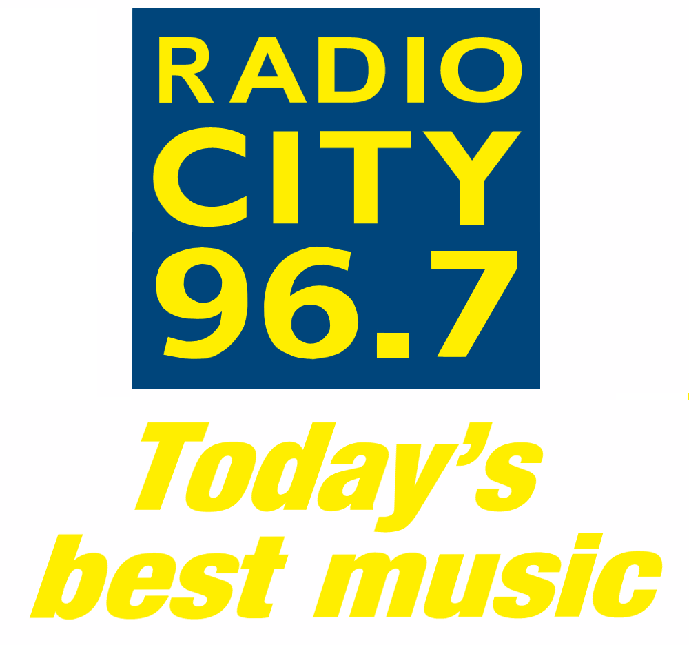
(18-04-2024, 11:40 AM)VMPhil Wrote: A planning permission application has been submitted to change the signage on the Radio City Tower, which has been the same since City moved there in the year 2000.
It will be a shame especially as they usually dim everything except 97 (previously 96) on 15th April to commemorate the Hillsborough victims.
www.liverpoolecho.co.uk
I've only just noticed that the RADIO CITY on the tower isn't the same as the cogwheel logotype - is it the same font but in all caps?
I'm also still trying to get my head around Hits Radio (which, we're told, is the Biggest Hits and the Biggest Throwbacks) and Greatest Hits Radio. Is Greatest bigger than Biggest? Which is best? (There's only one way to find out…)
Posts: 3,700
Threads: 18
Likes Received: 5,973 in 1,940 posts
Likes Given: 2,712
Joined: Jul 2022
Is radio subject to the same ad restrictions as TV - i.e. no more than 12 minutes an hour, an average of 9 minutes an hour over a day and no more than four breaks an hour?
Posts: 459
Threads: 1
Likes Received: 480 in 210 posts
Likes Given: 88
Joined: Jul 2022
(19-04-2024, 11:14 AM)Brekkie Wrote: Is radio subject to the same ad restrictions as TV - i.e. no more than 12 minutes an hour, an average of 9 minutes an hour over a day and no more than four breaks an hour?
Radio isn’t subject to any regulation when it comes to advert minutage.. you can do what you want & sell what you want (bar news coverage of course).
(18-04-2024, 07:17 PM)CATV Wrote: I listen to Hits Radio this evening on my drive home. I listen to about 20-25mins. There was three songs and a traffic update. The rest was ads. Way over the top. It's as bad as Capital who are now expanding there age to compete with Hits Radio. Going to be interesting to see who wins between Hits Radio and Capital. To be honest I can't wait for Radio 1 Anthems Station to launch. Sooner the better.
Interesting points, but I think Capital has already won with regards to being the “premium” youth brand in commercial radio. Kiss very much does/did that for Bauer too, so it’s all about getting Hits Radio to make some gains!
I heard from a friend a while ago that Hits were only playlisting new music “if Capital are playing it”, not very set on making their own sound. I don’t know if this has changed recently.
(19-04-2024, 10:43 AM)thegeek Wrote: I'm also still trying to get my head around Hits Radio (which, we're told, is the Biggest Hits and the Biggest Throwbacks) and Greatest Hits Radio. Is Greatest bigger than Biggest? Which is best? (There's only one way to find out…)
Yes - this has always thrown me about the branding of both of these stations.
Taylor Swift didn’t release any music in 70/80/90s, but most will consider her to have a “Greatest Hit”.
They’re both rubbish names, but at least Hits Radio does exactly that.. it’s about playing the hits. I think GHR is the one that needed a rethink, but they’ve dug the heels in too deep now!
(This post was last modified: 19-04-2024, 11:26 AM by
Ash101.)
Posts: 464
Threads: 3
Likes Received: 1,114 in 290 posts
Likes Given: 111
Joined: Aug 2022
(19-04-2024, 10:43 AM)thegeek Wrote: I've only just noticed that the RADIO CITY on the tower isn't the same as the cogwheel logotype - is it the same font but in all caps?
Yes! It's always been like that. And, as far as I can tell, that was never the official logo - the lowercase version was the one always used, in various colour schemes over the years, from 2000 (the same year they moved in to the tower) until the "Your" logo launched in 2015.
I can only think that, as the letters/numbers are on their own individual tiles/blocks, as illustrated if you zoom into the below linked photo, that the lowercase typeface would have looked strange if it was put up that way? Or perhaps wouldn't stand out as much as putting it in capitals?
www.flickr.com
Incidentally, I'm pretty sure the hoarding at the very top of the tower was installed originally to show a big "Liverpool 08" banner when the city was European Capital of Culture. Hopefully if they do get planning permission to change the sign they'll finally remove it as it's pretty ugly looking without anything on it!
![[Image: 1592580878_1869298444.svg]](https://up.metropol247.co.uk/062020/1592580878_1869298444.svg)
(This post was last modified: 19-04-2024, 12:35 PM by
VMPhil.)
Posts: 893
Threads: 2
Likes Received: 2,467 in 603 posts
Likes Given: 1,457
Joined: Oct 2022
Out on my travels this morning and I noticed the way the former TFM is named on DAB makes it sound like they’ve partly reverted to their original heritage name.

Either that, or the BBC local station for the area has launched a spin-off pop service.

Posts: 464
Threads: 3
Likes Received: 1,114 in 290 posts
Likes Given: 111
Joined: Aug 2022
(19-04-2024, 12:33 PM)VMPhil Wrote: Incidentally, I'm pretty sure the hoarding at the very top of the tower was installed originally to show a big "Liverpool 08" banner when the city was European Capital of Culture. Hopefully if they do get planning permission to change the sign they'll finally remove it as it's pretty ugly looking without anything on it!
Scratch that - I was wrong. Judging from this video, it seems this hoarding was installed at the same time, or at the least very shortly after, Radio City relocated to the tower. It doesn't even seem to have been used straight away...
youtu.be
Posts: 41
Threads: 1
Likes Received: 49 in 17 posts
Likes Given: 226
Joined: Oct 2022
(19-04-2024, 12:33 PM)VMPhil Wrote: Yes! It's always been like that. And, as far as I can tell, that was never the official logo - the lowercase version was the one always used, in various colour schemes over the years, from 2000 (the same year they moved in to the tower) until the "Your" logo launched in 2015.
I can only think that, as the letters/numbers are on their own individual tiles/blocks, as illustrated if you zoom into the below linked photo, that the lowercase typeface would have looked strange if it was put up that way? Or perhaps wouldn't stand out as much as putting it in capitals?
www.flickr.com
Incidentally, I'm pretty sure the hoarding at the very top of the tower was installed originally to show a big "Liverpool 08" banner when the city was European Capital of Culture. Hopefully if they do get planning permission to change the sign they'll finally remove it as it's pretty ugly looking without anything on it!
I think it was also based on the previous logo a bit as it fits in with that colour scheme.
static.wikia.nocookie.net
The thing on the top of the tower was used for Liverpool 08 and then Ford had an advert on it for a while, I doubt it will be going anywhere as I'm sure that's the DAB Signal for Liverpool.
Posts: 47
Threads: 0
Likes Received: 57 in 23 posts
Likes Given: 2
Joined: Oct 2022
With the announcement of the switch to Hits made in January, so 4 months to prepare for all the rebranding etc, you’d have thought that by now the studios would be up to date with branding. Over at Hits NE though…
ibb.co
ibb.co
Posts: 452
Threads: 3
Likes Received: 887 in 267 posts
Likes Given: 467
Joined: Jul 2022
The changes have reportedly caused a problem on DAB in Leicestershire. The former Gem (now Hits) stream had its bitrate slightly reduced from 128k to 112k, but GHR was upgraded from 80k mono to 112k stereo. The net result is that the DAB ensemble there is now running at 866 capacity units, but the maximum allowed by the DAB spec is 864 CUs. In other words, the multiplex is slightly overloaded? There wasn't enough space for the changes Bauer have made.
Reports of problems with receivers tuning into stations on that ensemble, because it's out of spec. To be fair, Arqiva operate that multiplex and they should have noticed! The easiest fix would be to reduce the bitrate of the old Hits UK stream, now labelled RETUNE (until it's removed altogether, obviously). It's still taking up 80k on the ensemble even though it's now redundant.
This was certainly true as of just before 5pm yesterday, which is the last time Digital Bitrate updated...
(This post was last modified: 21-04-2024, 01:29 PM by
IanJRedman.)
Posts: 336
Threads: 3
Likes Received: 469 in 196 posts
Likes Given: 22
Joined: Sep 2022
(19-04-2024, 10:53 PM)mixchris Wrote: With the announcement of the switch to Hits made in January, so 4 months to prepare for all the rebranding etc, you’d have thought that by now the studios would be up to date with branding. Over at Hits NE though…
ibb.co
ibb.co
At least they've tried to keep the old logo out of view.
Anyway, it looks like this is the way to do it right:
twitter.com
![[-]](https://pres.cafe/images//collapse.png)

 Source: