03-06-2024, 03:11 PM
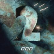
Hello folks. Recently I have found myself thinking again and again about the Martin Lambie-Nairn idents made for BBC2 in the nineties...

I really can't think of a TV continuity package as admired as these. They set an incredibly high bar for what idents could accomplish, they're credited with the revival of their parent channel's fortunes, and they're memorable (and remembered) enough that they actually got brought back for a second go over fifteen years later. Now there's impact for you.
Nowadays, should you google the phrase "bbc2 idents", these ones will automatically come up as the first result, with a link to their Wikipedia page, despite the fact there have been three new packages introduced since.
I think there are many reasons why these idents are thought of so fondly. First there's the sheer variety, even from launch (which only intensified as the set grew); the distinctive colour palette; the gorgeous music; it all came together splendidly. I think the height of the set came with the 1997 rebrand which added one more special wrinkle: the very clean BBC TWO logo, which would, brilliantly, fade into the ident rather than simply appear with it. The timing of this fade adds an extra element of pleasure, especially when co-ordinated with the music and visuals (see 'Optics' and 'Duck' especially for this effect).
But then there's also the added layer of what these idents represent for the channel. 'Paint', the first-show and most-remembered, provided a visual translation of the idents' effect on the channel: shaking up a grey "dull and worthy" (Lambie-Nairn) public conception with a striking splash of colour and vividity. It's especially impressive once you note how it's all done with practical effects (though later idents would go on to use CG).
So, reflecting on this wonderful presentation package (and all of its instalments and refreshes), I thought it would be interesting to ask: which particular idents from the package do you think represent its finest?
I think the fluffy 'Dog' ident is particularly charming and while future idents would diverge more from the colour scheme introduced in 1991, it strikes a balance of visual appeal, experimentation and cohesion with the existing set, pushing boundaries into being more 'fun' and 'silly' while still cohering nicely with the existing group and allowing it to evolve. It's nice to see the idents spread their wings over time and become more experimental; it's a shame the unaired 'Warp' ident was never broadcast, but of the 2000 set I think 'Excalibur' and 'Wave Night' are utterly splendid. I've always got a kick out of some of the simpler ones too, the likes of 'Balloon' for its trilling music and 'Copper Sparks', which is just so soothing and cosy.


![[-]](https://pres.cafe/images//collapse.png)
![[Image: BB50.png]](https://up.metropol247.co.uk/Blewatter/BB50.png)
