Posts: 676
Threads: 0
Likes Received: 2,518 in 509 posts
Likes Given: 431
Joined: Jul 2022
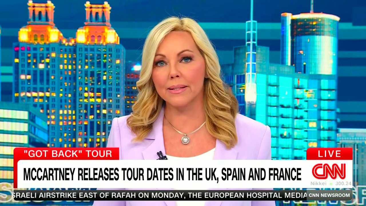
That's a nice shot. The presentation overall is so dire these days, even the smallest detail like that can liven up the proceedings. London has the best set and it's sad it's barely used right now.
As for the new Atlanta set, the more I see of it the worse it looks. White, plastic, small corner with that jarring city background. Even the old CNNI set looked bigger and had more variety.
I don't think the channel ever looked worse, set-wise, even the World Report orange/yellow/blue mess era was better cause they actually still tried back then.
i.postimg.cc
i.postimg.cc
(This post was last modified:
3 hours ago by
ginnyfan.)
Posts: 328
Threads: 0
Likes Received: 515 in 226 posts
Likes Given: 421
Joined: Aug 2022
(4 hours ago)oscillon Wrote: May be they thought that "CNN Presidential ebate" label on most other channels will strengthen their brand as compared to a single exclusive boost in ratings.
Having the CNN logo on the other networks that carry it (C-Span, CBS, ABC so far confirmed) is a strong branding move, a good move for public service, and the right decision. It's also a case of playing fairly so that the other debates (ABC) are available to CNN as well.
(3 hours ago)ginnyfan Wrote: I don't think the channel ever looked worse, set-wise, even the World Report orange/yellow/blue mess era was better cause they actually still tried back then.
CNN are in need of a visual refresh. The on-air visuals just aren't cohesive, the graphics are clunky, and a lot of the sub-brands have been watered down. The studios used to follow a design idiom, but now none of the bureaus match. If they were smart they'd be working on this now and launching before the election.
(This post was last modified:
2 hours ago by
EastCoast.)
Posts: 35
Threads: 0
Likes Received: 42 in 22 posts
Likes Given: 4
Joined: Sep 2022
(2 hours ago)EastCoast Wrote: Having the CNN logo on the other networks that carry it (C-Span, CBS, ABC so far confirmed) is a strong branding move, a good move for public service, and the right decision. It's also a case of playing fairly so that the other debates (ABC) are available to CNN as well.
.
That's if it goes well! The last townhall with Trump was received negativey if I recall correctly.
Hopefully Dana and Jake can keep them in line and stop it from becoming an uncontrolled shouting match!
(3 hours ago)ginnyfan Wrote: That's a nice shot. The presentation overall is so dire these days, even the smallest detail like that can liven up the proceedings. London has the best set and it's sad it's barely used right now.
As for the new Atlanta set, the more I see of it the worse it looks. White, plastic, small corner with that jarring city background. Even the old CNNI set looked bigger and had more variety.
I don't think the channel ever looked worse, set-wise, even the World Report orange/yellow/blue mess era was better cause they actually still tried back then.
i.postimg.cc
i.postimg.cc
When the smaller set debuted in Atlanta, it was quite okay. Smaller but they had some good shots, changed the colours and the desk and anchors used different positions/different screens. Then the blue and that awful blue/yellow era started and it all went downhill!
(This post was last modified:
26 minutes ago by
gman.)

![[-]](https://pres.cafe/images//collapse.png)