13-06-2024, 02:35 AM
(07-06-2024, 10:47 PM)ViridianFan Wrote: When I was teaching year 5/6 we did a unit “evolution of the media”. For the art that half term we looked at TV idents, with the idea of then creating their own version using the school badge...
Ah, what an absolutely lovely story — and proof that channel presentation, interstitials and idents really do shape our engagement with TV as a format... and testament to how creative these idents were.
(11-06-2024, 11:24 PM)JACKLUFC1998 Wrote: I didn't seem them properly until when the second run (so 2014-2018 of course), but the Fluffy Dog and Car idents are my two favourites. I know in the second run, the Paint ident was seen on BBC2 NI only, bit wasn't there another version of it that was used (not just by NI, but by Network, Wales and Scotland also) to introduce Saturday Mashup on Saturday mornings?
I'm not sure, but I think I remember a recoloured Pride version with rainbow instead of viridian paint?
This is another thing, though, about BBC2's reintroduction of the ident set in 2015. Aside from the slapdash application of the box (which was fine when it was also viridian but horrible when they did it in white or other colours), the selection of idents was both too narrow (especially when they first started reappearing and Swan was overplayed) and, crucially, Paint Pot didn't really work as well without Paint.
They covered most of their bases — got a lot of the classic and best-remembered ones in (Dog, Car, Silk, Optics, Zapper, Duck, Swan, Woodpecker, Predator) but really Network should have brought back a couple more of the more sober and simple early ones (Paint, Copper Sparks, Powder) and a couple of the 2000 ones which had barely been shown first time round (Excalibur, Wave Night especially).
I wonder if one factor was the offset box, which — although always an unkempt fudge — works better on the more motion-intensive idents, like Car/Dog/Optics, than it might do on those where the 2 just stays still.
(12-06-2024, 03:14 PM)F4C Wrote:(12-06-2024, 12:31 PM)Neil Jones Wrote: The Curve idents are probably one of the better packages they've had since 1991.
The Personality series wasn't too bad, even if it was a bit yellow and in-your-face sometimes.
Less said about Window on the World, the better IMO, it all felt a bit flat there.
The Curve idents are definitely a lot more creative than the Window ones, which felt a bit too static and bland. The Personality ones, like you said, were fine as idents for stuff like Top Gear. Not so much for Newsnight or more serious shows.
I'm a big fan of the Personality Twos. It's difficult because they had a very tough act to follow, and then adding this to the fact that the previous, much-lauded set were arguably retired prematurely (those 2000 idents aired for what, a year and a bit? - Wave Night just over a year), and the initial launch set then only consisted of four idents alone. You can also see a very clear visual debt owed (or cleverly recycled by Lambie-Nairn?) to the 90s idents: the colour scheme and basic model of Car, the same four-note musical sting used in Firecracker and Duck, and the 2 emblem itself. So in a way, as an ident package, it sort of lives in the shadow of what came before.
Shame, too, because I think they're sneaky-good, you know? The big robotic two, which always reminded me a little of the Cooker from Wallace and Gromit's A Grand Day Out, and the sense of personality that they idents convey, sometimes quite subtly (the scaring and then gradual befriending of the shoal in Fish, the quite visual annoyance in Sticky Logo and Domino, the playfulness of some of the other ones like Drum and Flamethrower). I think you do end up warming to the 2. The music side of it was a good match too.
Really, the idents were trying to build off of some of the most effective and warmly-appraised elements of the 90s set, building on the increasing sense of anthropomorphism of the 90s idents (especially Dog and Car). And for the most part I think it works, although maybe they could have added more sequences over time and perhaps dropped a couple of them too (like Domino, where the joke probably got old a bit quickly). The Christmas idents were good though (maybe not the ice cube one, which always seemed more summery than wintry to me).
Perhaps they adhered to the brash yellow colour scheme too strictly. Even the 90s idents began to diverge from the viridian colour before too long; it's barely there in Duck (the water?) and Aerial (the 2's cyan, but it's a very subtle cyan), it's not there at all in Predator or Kebab or Swan. But even then, Duck was introduced six years in... and the Personality 2s only lasted six years.
(The colour scheme was probably the weakest part of the entire rebrand. Yellow and purple, nice colour combo on paper, but which actually IS the house colour? The one the idents are, or the one the logo's in? It's little wonder they reverted to teal in 2007.)
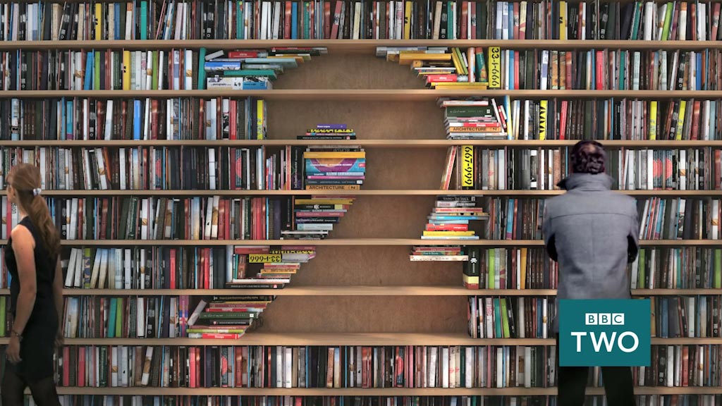
(12-06-2024, 07:10 PM)Spencer Wrote: The trouble with the Window on the World idents was the creative scope was very limited by the concept.I always thought it was a bit derivative of what Channel 4 was doing at the same time — the numeral is formed by some kind of landscape or scene.
The original 2s concept shows you can make a solid 2 out of almost anything, and do almost anything to it, but the Windows limited the scope only to things which typically have holes in them. And when your logo is essentially the missing bit from a scene, there’s not a lot of interesting stuff you can do with it.
Plus they generally faffed about with them — the amateurish Tagging idents, the musical changes (who wants to turn on the TV and be constantly reminded of alt-J's existence???), the trail shenanigans, and the unnecessary realignment of the box which in turn meant they 'had' to get rid of the Cappuccino ident, which was probably one of the best.
(12-06-2024, 07:55 PM)Stooky Bill Wrote: I think it's several shots of two 2s edited mixed together into a longer sequence
It's certainly cleverly edited, because I for one have no idea what's going on here.
![[-]](https://pres.cafe/images//collapse.png)