Posts: 3,718
Threads: 18
Likes Received: 6,039 in 1,953 posts
Likes Given: 2,732
Joined: Jul 2022
Aren't they one of the few shows to use the correct logo in the titles?
And the BBC weren't lying when they said it would return "later this year" after going off air when Strictly began.
Posts: 903
Threads: 2
Likes Received: 2,490 in 608 posts
Likes Given: 1,466
Joined: Oct 2022
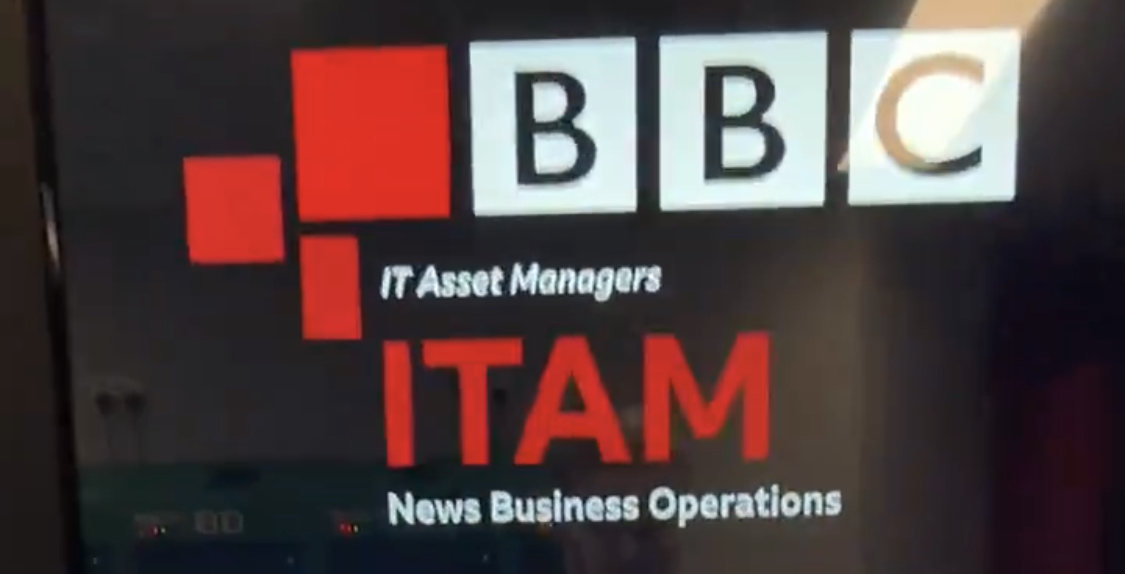
I love how the largest block of the News service icon has been carefully and thoughtfully aligned and spaced with… a dodgy version of the old Gill Sans logo.
x.com
up.metropol247.co.uk
Presumably this is a case of the IT Asset Managers coming up with their own internal logo and producing what could kindly be described as a dog’s breakfast.
(This post was last modified: 07-12-2023, 08:41 PM by
Spencer.)
Posts: 1,001
Threads: 2
Likes Received: 763 in 375 posts
Likes Given: 73
Joined: Jul 2022
At least it's just a digital image - it's an easy fix if a brand manager has a word with them.
Posts: 903
Threads: 2
Likes Received: 2,490 in 608 posts
Likes Given: 1,466
Joined: Oct 2022
(08-12-2023, 01:25 PM)JAS84 Wrote: At least it's just a digital image - it's an easy fix if a brand manager has a word with them.
Well it should be, but so should be replacing the logo on programme endboards, EastEnders titles, Politics Live titles/studio, etc., etc..
Oh, and the new vending machine has a physical Gill logo above the screen too.
Posts: 1,673
Threads: 3
Likes Received: 2,077 in 822 posts
Likes Given: 153
Joined: Jul 2022
£41.50 for a USB cable? I know it's an Apple product and they overcharge, but yeesh....
Posts: 1,074
Threads: 3
Likes Received: 1,323 in 524 posts
Likes Given: 358
Joined: Jul 2022
The same item is £49.00 on the Apple Store website, so at least the silly price is the Apple tax, not whichever supplier provides this vending machine adding a hideous mark up.
Posts: 169
Threads: 2
Likes Received: 1,435 in 155 posts
Likes Given: 694
Joined: Oct 2022
WTF is going on with BBC World Service branding?
As @AndrewP mentioned a few weeks ago, the World Service was one of the last major BBC brands to still be using the old logo, seen here:
ibb.co
Indeed, in a press release published
today, you can
still see the stripped/horizontal version of the same logo in one of the podcast images accompanying that release (
www.bbc.co.uk ).
And yet, the World Service
does now have a Chameleon logo, which is in use on its social media:
ibb.co
I'm not sure exactly when that logo was introduced, but the World Service Twitter/X account was still using the old logo quite recently.
But an entirely different logo for the World Service is
also in use, featuring a fusion of the old logo with a new Chameleon style. That logo can be seen on the Freeview Play EPG on smart TVs...
ibb.co
...and you can see a pixelated closeup here:
ibb.co
A colour version of this logo is also in use on the Freeview mobile app...
ibb.co
...closeup here:
ibb.co
If this additional BBC News version of the logo had only appeared as the all-white version, I might be persuaded to believe that someone at Freeview had simply mocked up a new version of the old logo in the updated style. But the fact that there's also a colour version of the logo, with the correct colour and formatting, lends far more weight to this being an official logo (as we've all seen, unofficial mock-ups rarely show this kind of attention to detail).
So why on earth would the BBC create two completely different versions of the new logo -- one with 'NEWS' branding, and one without?
And why was 'NEWS'
ever part of the brand in the first place? It's known universally -- including by the BBC ffs!
www.bbc.co.uk -- as the 'BBC World Service'.
Eugh.
(This post was last modified: 19-12-2023, 09:38 PM by
LDN.)
Posts: 26
Threads: 0
Likes Received: 37 in 18 posts
Likes Given: 21
Joined: Dec 2023
The same 'BBC News World Service' branding is in use (in colour) on Virgin Media V6 boxes too.
Posts: 89
Threads: 0
Likes Received: 167 in 51 posts
Likes Given: 4,209
Joined: Aug 2022
In fairness the World Service lost most of its non-News content.
If I remember rightly just half a decade ago the Burmese service still had its own little soap and tech segment and broadcast on the radio for an hour twice each day, now it just has one 15-minute bulletin with an immediate repeat to fill 30 minutes...
The branding for all the languages has been BBC NEWS | Language for quite some time now
The listening guides, which they still haven't updated for the winter for some reason still uses Gill Sans throughout
downloads.bbc.co.uk
At school they taught me how to be
So pure in thought and word and deed
They didn't quite succeed...
Posts: 658
Threads: 0
Likes Received: 1,668 in 452 posts
Likes Given: 5,200
Joined: Oct 2022
And the logo in use on that PDF on the top right is the pre-2019 old red box of a different shape.
It’s the wrong shape, the wrong red & the wrong font!
![[-]](https://pres.cafe/images//collapse.png)