International News Presentation: Past and Present

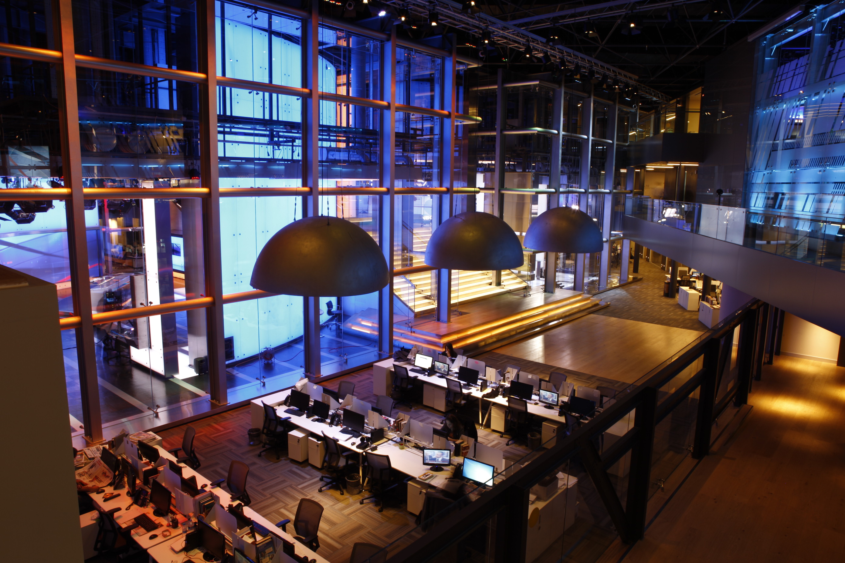
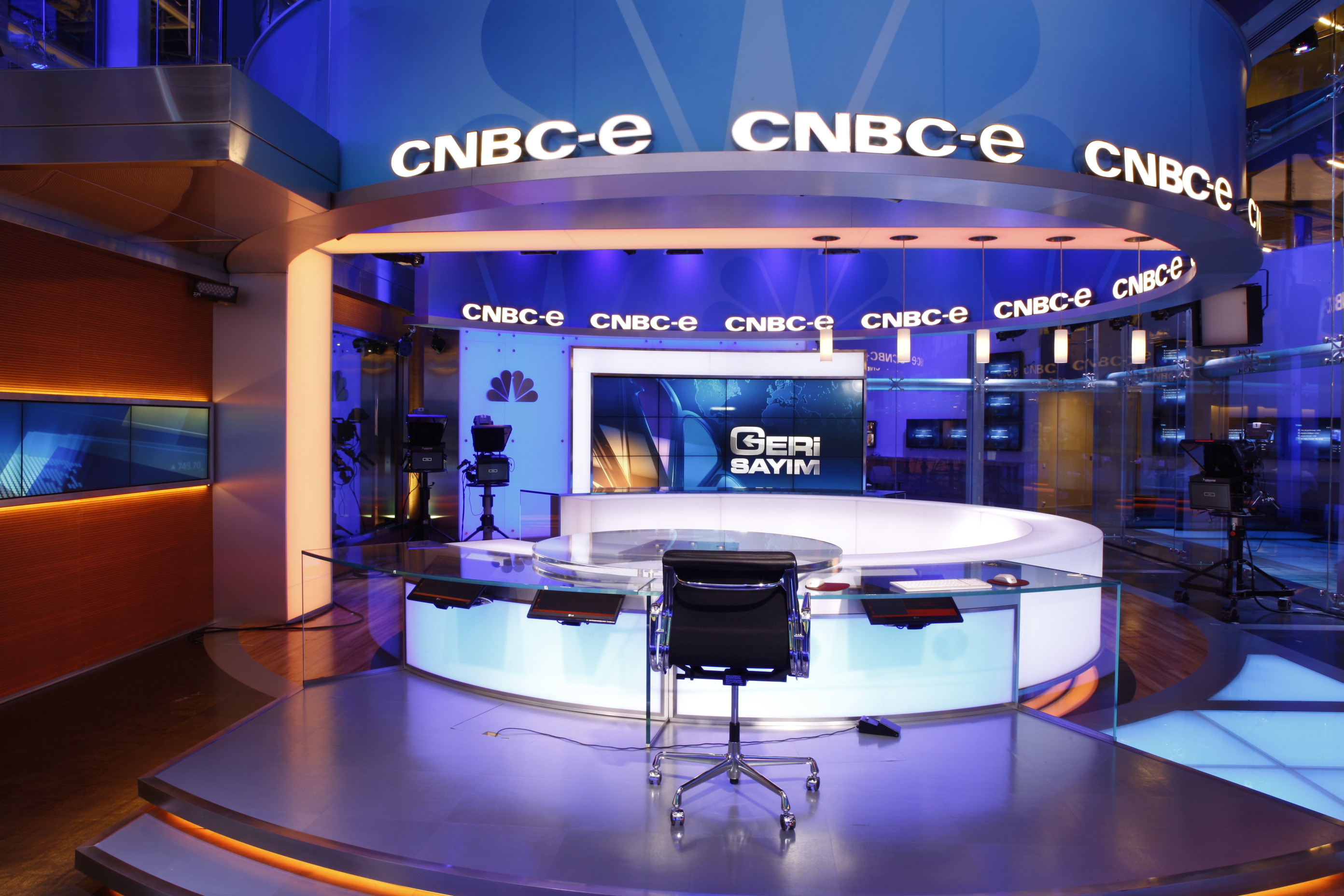
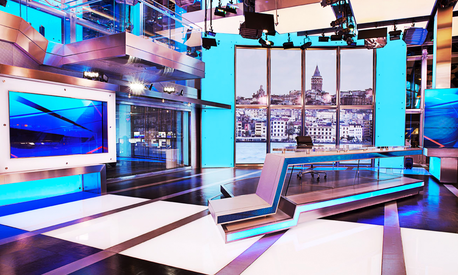
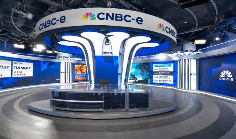
(28-05-2024, 07:45 PM)leewilliams Wrote:  New minimalist graphics package for DW:

ibb.co 

ibb.co 

ibb.co 

ibb.co 

ibb.co 

Lot less of a minimalist package, more like Deutsche Welle brand revision, part 4:
Pt. 1 was with the brand new DW logo and brand identity, but Journal still existed
Pt. 2 was out with the Journal and in with the new DW News brand, complete with graphics and new music based on DW's then sounder.
Pt. 3 was with a major rebrand on everything except the news graphics, which went rather minor. Sure they got new music (once again, coinciding with DW's new sounder), but nothing else, except with (some) new fonts, which I found less impressive than the old ones they used.
And finally Pt. 4, with the new fonts, and slightly refreshed News graphics. I find these new fonts much better than the one in Pt. 3, though they still use the old font in the countdown. I hope to see it change.

"Please stand by for further details, as we return you now to your regularly scheduled program. Hopefully."
Reply

(03-06-2024, 04:53 PM)Edogawa Ranpo Wrote:  So I noticed a rather different looking set on NRK's Dagsrevyen and I'm not too sure about it but seems their corporate rebrand rollout on TV is imminent, even though their radio stations have the new logos already.
I think this might be a temporary set for now until the new look graphics debut on screen, I dunno.
tv.nrk.no 

I don’t have a precise date, but it’s been confirmed NRK news is indeed going for a full rebrand and we should see it potentially later this month!

Will he interesting to see how extensive the new set for Dagsrevyen is. May just be a standard copy and paste large screen that’s become the norm across Europe these days. I say that because NRK is moving to a new HQ in a couple of years, so I wouldn’t expect any significant technical upgrade behind the scenes in the studio.
Reply

While we wait for the launch of NRK's new studio, Yle has formally unveiled today a brand new look for its daily news and sport programming. Replacing a look dating back to 2014 and a studio dating back to 2019, the 10 million new studio, built in another studio space inside Yle’s Helsinki HQ, was a fully in-house work, developed under the direction of creative director Mika Lavonen, whilst the new graphics were done by DixonBaxi. Lavonen said the decision to replace the 2012 look was due to its already cold and drap design, disconnected with its audience, instead of the Yle teal, lila purple and lime green are used for news and sport. The high cost of the new studio has generated strong controversy by many of its competitors, some politicians, and local tabloids.

youtu.be 

yle.fi 

yle.fi 

yle.fi 
[-] The following 1 user Likes Medianext.MX's post:
  • JosiahStuart
Reply

CNBC-e, the Turkish version of the business news channel, is back after a nearly 10-year hiatus, and, alongside the relaunch, they become the first of the global CNBC's to adopt the new US look of the network for business day programming, although with different music:

www.youtube.com 

The return of the network has been on the works since last year, after İlbak Holding, a major Turkish business conglomerate with no media experience other than on the OOH sector, bought the name from the Demirören Media Group, owners of NTV and previous owner of the network, after signing a license deal with NBCUniversal. The network has brought back many of its editors and anchors, and its programming is a mix of business news programming, and, on primetime and weekends, imported American shows dubbed into Turkish (thanks to partnerships with Paramount and Disney) and CNBC International content, plus a local version of BBC2’s Letterbox and some local lifestyle programming. The first incarnation of CNBC-e closed in 2015, after Demirören sold the network to Discovery EMEA, which replaced it with a local version of TLC.

www.cnbc.com 
Reply

Wow this iteration of CNBC-e is certainly a far cry from its previous version and you clearly see the owner has zero broadcasting experience. Its all "off" in my opinion. They have a "fancy" set and stuff. But it all feels dated, even the style of having the presenters charging around and sitting down and makeup people fluttering about in the promos... Very old school and superstaged looking. Ive seen it done before but using actual footage of the anchors moving about. But the odd music choice. And the horrific flat "blast" lighting and the screens are clearly not bright enough for broadcast. The stilted presentation style. But that set. I was horrified. The strange oddly stretched NBC Peacock logo that forms those odd columns. YOu can tell that they didnt hire an international firm to design this set like the previous channel used the professional Clickspring design firm. I dont want to be too harsh, but that newsroom and other areas behind the scenes and the colours they chose. Those bright loud stripes. I would be having seizure working there. Its simply just awful. Im sorry. Im sure they will update things over the years. But you can clearly see the owners inexperience in so much. Even the behind the scenes areas. THe positive is they have the updated CNBC graphics package. Yay. I guess.

Here is the previous ClickSpring set design. and LDG Lighting scheme
www.newscaststudio.com 
Web Image


www.newscaststudio.com 
Web Image


www.clickspringdesign.com 
Web Image


this is just strange. Its interesting that NBC allowed them to basically modify the peacock logo. You'd think it would be against NBC's design guide. But I guess since its a set...I dont. I think its hideous.
www.malatyadan.com 
Web Image

[-] The following 1 user Likes mouseboy33's post:
  • Medianext.MX
Reply

Here's a look at the new look Yle News and Sport including the just launched new look Ylen Aamu morning show.
Love how each news programme has its own colour alongside the main purple.

Uutiset 18.30
youtu.be 

Uutiset 21.30
youtu.be 

TV-nytt (Swedish language news)
youtu.be 

Urheiluruutu (sports bulletin)
youtu.be 

A-studio
youtu.be 
And here's the new look Ylen Aamu with a nice mix of the new Yle Uutiset purple with a morning shade of cream.

youtu.be 
[-] The following 3 users Like Edogawa Ranpo's post:
  • Globaltraffic24, JosiahStuart, Medianext.MX
Reply

(10-06-2024, 06:32 PM)mouseboy33 Wrote:  The positive is they have the updated CNBC graphics package. Yay. I guess.

There's just one problem with it... The graphic style guide they "received" was the demo reel (at vimeo.com ) instead of U.S. modifications for font and letter formatting.

I have compiled the following exhibit for comparison. The first column is the demo reel, the second one is U.S. alterations, and the third one is how CNBC-e "brought them back."

up.metropol247.co.uk 
Web Image


(The last one was taken from CNBC-e promo because the channel has not shown a single chart to this moment. For a financial/business news channel, it is telling that that isn't a typo.)

Although one upside from that promo is we at least see what happens to CNBC affiliates when the global feed is not carrying business programming...

up.metropol247.co.uk 
Web Image

[-] The following 1 user Likes news727's post:
  • Medianext.MX
Reply

NEW LOOK NRK NEWS IS IMMINENT!
Looks similar to what Australia's ABC News had in 2010, but with a warmer colour scheme of the NRK blue (in numerous light and dark shades) with an orange-red.
I do wonder if NRK's channels have launched a new look at the same time.
gfx.nrk.no 
Web Image

Reply

(03-06-2024, 04:53 PM)Edogawa Ranpo Wrote:  So I noticed a rather different looking set on NRK's Dagsrevyen and I'm not too sure about it but seems their corporate rebrand rollout on TV is imminent, even though their radio stations have the new logos already.
I think this might be a temporary set for now until the new look graphics debut on screen, I dunno.
tv.nrk.no 

Confirmed! Dagsrevyen at 7pm will be the first we see of NRK’s new look news service…
www.nrk.no 
[-] The following 1 user Likes Globaltraffic24's post:
  • Edogawa Ranpo
Reply

(12-06-2024, 02:09 PM)Globaltraffic24 Wrote:  Confirmed! Dagsrevyen at 7pm will be the first we see of NRK’s new look news service…
www.nrk.no 

Whilst Dagsrevyen will be the first to use the new studio, their Sami language news programme Ođđasat has launched their new look. Obviously it'll be a bit different to other NRK Nyheter output, but it gives an idea of the direction of travel.

youtu.be 

I kissed a gull and I liked it!
Reply


Forum Jump:


Users browsing this thread: 3 Guest(s)