The BBC Chameleon Thread

(29-06-2024, 12:21 AM)fanoftv Wrote:  A case of the old logo lingering on, the Glastonbury coverage ends with the old logo within the BBC Studios Music endcap.

However the correct, present logo is used on the titles and over streaming and branding.

I just point out that it’s only been the broadcast highlights programmes that have featured the old logo, all streamed sets have started and ended with the correct logo.
[-] The following 2 users Like fanoftv's post:
  • Happy2001, JosiahStuart
Reply

1988 BBC Logo on the countdown clock to Coldplay on the Pyramid Stage at Glastonbury    
[-] The following 5 users Like TVNerd's post:
  • Ant, bkman1990, LargelyALurker, Ma76, Reith85
Reply

(29-06-2024, 09:59 PM)TVNerd Wrote:  1988 BBC Logo on the countdown clock to Coldplay on the Pyramid Stage at Glastonbury

Another perfect example of continuity... Tongue Big Grin
[-] The following 2 users Like harryb's post:
  • bkman1990, fanoftv
Reply

The third championship since the revamp and the old logo still on the mic flags. Baffling when lesser events than Wimbledon get the new logo.
[-] The following 1 user Likes Brekkie's post:
  • fanoftv
Reply

I got a newsletter emailed to me from Coldplay about their performance in Glastonbury.

It's shows a photograph of Chris Martin on the Pyramid Stage at Glastonbury with the old BBC Music logo in a black box on the top right hand side of the photo.

   
[-] The following 1 user Likes bkman1990's post:
  • LargelyALurker
Reply

Some random thoughts...

- - -

I deeply loathe the hideous BBC Indepth branding, much like the BBC Verify branding on which it's closely based.
   

But while I certainly find the ghastly colours and miserably lazy circular design theme to be most unpleasant, it's the logo itself that gets my designer's eye twitching uncontrollably.

Why doesn't the 'INDEPTH' part of the logo align in any way with the BBC logo next to it?
ibb.co 

Eugh.

And speaking of BBC Verify, it was originally announced with this branding...
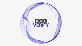
   

...featuring a black BBC logo, indigo 'VERIFY', and a dynamic swirling orb. In my opinion, it's a simple but attractive brand design. So what happened to this design? Why is it now only seen very occasionally during presentations from the Verify balcony area?

And why has this ⤵️ completely different logo come to be used instead to represent BBC Verify everywhere else on the BBC News channel, website and app?
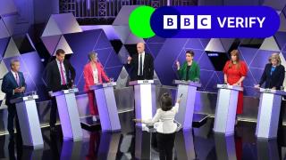
   

Why did the logo end up in a horizontal lozenge? Why the two overlapping circles, and how do they connect with the rest of the brand? And where did that revolting neon green come from?

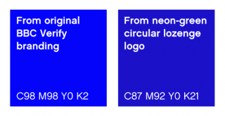
It's like two completely different brand identities. The use of indigo is all that connects them -- and of course, with typical attention to detail, the BBC didn't use the same indigo between them:
   

- - -

Moving on...

WTF I can't even--
   

But it's not all bad news.

Gentlemen on Grindr with... uh... *coughs* ...with big black c*cks have finally started using the Chameleon version of the BBC logo:
ibb.co 

Given the glacial pace at which the new logo continues to roll out publicly, I'd call that progress.
[-] The following 6 users Like LDN's post:
  • BritCan, LargelyALurker, Mike, Spencer, Tim G, what
Reply

(Yesterday, 08:50 PM)LDN Wrote:  Some random thoughts...

- - -

I deeply loathe the hideous BBC Indepth branding, much like the BBC Verify branding on which it's closely based.


But while I certainly find the ghastly colours and miserably lazy circular design theme to be most unpleasant, it's the logo itself that gets my designer's eye twitching uncontrollably.

Why doesn't the 'INDEPTH' part of the logo align in any way with the BBC logo next to it?
ibb.co 

Eugh.

And speaking of BBC Verify, it was originally announced with this branding...


...featuring a black BBC logo, indigo 'VERIFY', and a dynamic swirling orb. In my opinion, it's a simple but attractive brand design. So what happened to this design? Why is it now only seen very occasionally during presentations from the Verify balcony area?

And why has this ⤵️ completely different logo come to be used instead to represent BBC Verify everywhere else on the BBC News channel, website and app?


Why did the logo end up in a horizontal lozenge? Why the two overlapping circles, and how do they connect with the rest of the brand? And where did that revolting neon green come from?

It's like two completely different brand identities. The use of indigo is all that connects them -- and of course, with typical attention to detail, the BBC didn't use the same indigo between them:

I’m glad I’m not the only one who hates the bbc In-depth and verify branding.

Every time I see the lozenges all I can’t think of the bar they use to display at the bottom of the screen for the lotto draws!

I also think the blocks and curved edges that close don’t look right.

It feels like we’re going back to having a lot for everything when I thought one of the ideas behind the Chameleon rebrand was so that there wasn’t multiple instances of the logo on the screen at the same time.

It does feel like they are starting to water down the bbc news branding. There are more and more colours coming on board. The reason the branding has been so successful up until this point red has been the primary colour linking everything together. That’s getting weaker which I think is a negative.

If they are insisting on having logos for in-depth and verify they should go back to a rectangle in bbc news red but it laid out as:
BBC NEWS |INDEPTH
BBC NEWS |VERIFIED

Although I really hate the name verified - everything is verified but it makes it sound like it’s not. They should have gone for “reality check” or “bbc monitoring”.

Part of me wonders if the bbc verify logo has vanished because they’ve decided it could replace the globe. There is a brilliant mock on YouTube based on the bbc news icon which uses lots of squares forming the globe.

(Yesterday, 08:50 PM)LDN Wrote:  Moving on...

WTF I can't even--


But it's not all bad news.

Gentlemen on Grindr with... uh... *coughs* ...with big black c*cks have finally started using the Chameleon version of the BBC logo:
ibb.co 

Given the glacial pace at which the new logo continues to roll out publicly, I'd call that progress.

This is brilliant!! We’ve have someone round here who’s used to use the old bbc logo. Just a shame he’s not followed guidelines and have the logo at the top and the icon at the bottom

Just a ident loving pres.fan from the East of England 
All spelling mistakes are my own #Dyslexic@Keyboard 
[-] The following 1 user Likes ViridianFan's post:
  • LDN
Reply

Didn't Verify replace something that was called Reality Check?
Reply


Forum Jump:


Users browsing this thread: ATee, 8 Guest(s)