Posts: 172
Threads: 2
Likes Received: 1,443 in 158 posts
Likes Given: 708
Joined: Oct 2022
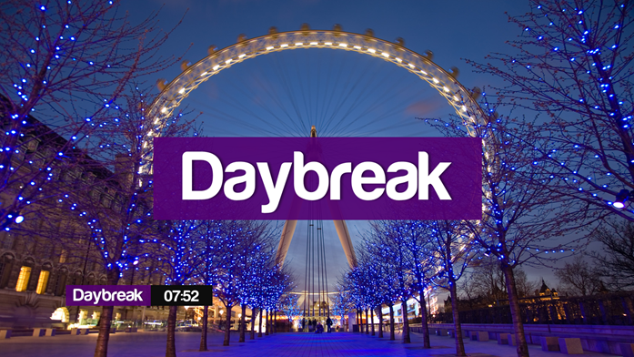
(16-05-2023, 03:03 PM)Newsroom Wrote: (16-05-2023, 03:00 PM)Former Member 406 Wrote: Purple for a breakfast programme just made me think of Daybreak mk1 (2010, not 1983!).
Exactly what sprung to my mind.
![[Image: db_9.png]](https://up.metropol247.co.uk/Newsroom2018/db_9.png)
Nothing says '
good morning!' like deep purple and black, with a smattering of sh!tty typography.
Posts: 246
Threads: 1
Likes Received: 320 in 138 posts
Likes Given: 52
Joined: Sep 2022
Was that real or a mock? Wasn’t daybreak 2010 v1 purple and grey with yellow accent?
![[Image: MV5BZTlkNzMyYWQtMjAwZS00NTkxLTg1NDEtM2Rj...@._V1_.jpg]](https://m.media-amazon.com/images/M/MV5BZTlkNzMyYWQtMjAwZS00NTkxLTg1NDEtM2RjZDc3YzI4ZGVmL2ltYWdlL2ltYWdlXkEyXkFqcGdeQXVyMDkwNTkwNg@@._V1_.jpg)
(This post was last modified: 16-05-2023, 04:40 PM by
Mike.)
Posts: 879
Threads: 3
Likes Received: 1,807 in 531 posts
Likes Given: 911
Joined: Aug 2022
(16-05-2023, 04:02 PM)Mike Wrote: Was that real or a mock? Wasn’t daybreak 2010 v1 purple and grey with yellow accent?
m.media-amazon.com
The image is from this thread...
www.tvforum.co.uk
Posts: 879
Threads: 3
Likes Received: 1,807 in 531 posts
Likes Given: 911
Joined: Aug 2022
(16-05-2023, 04:02 PM)Mike Wrote: Was that real or a mock? Wasn’t daybreak 2010 v1 purple and grey with yellow accent?
m.media-amazon.com
They definitely played with red and purple.
youtu.be
Posts: 172
Threads: 2
Likes Received: 1,443 in 158 posts
Likes Given: 708
Joined: Oct 2022
(16-05-2023, 04:02 PM)Mike Wrote: Was that real or a mock? Wasn’t daybreak 2010 v1 purple and grey with yellow accent?
Hmmm. That does look more familiar.
And yet, somehow, no less terrible.
Posts: 127
Threads: 0
Likes Received: 183 in 57 posts
Likes Given: 16
Joined: Apr 2023
Is that twitter handle a reliable source?
Posts: 780
Threads: 11
Likes Received: 927 in 572 posts
Likes Given: 555
Joined: Jul 2022
(16-05-2023, 04:02 PM)Mike Wrote: Was that real or a mock? Wasn’t daybreak 2010 v1 purple and grey with yellow accent?
Yep, that's a mock - back in December 2011, done by tvmocker14 on Metropol (db 9.png):
up.metropol247.co.uk
And it's, of course, at the blue place as well:
www.tvforum.co.uk
[Newsroom beat me to it

]
Still,
purple of all colours, when most other breakfast shows (even those outside UK) are using a variant of orange and yellow? Hmmm...
Watch this space...
WestKnightTV - on DeviantArt
(This post was last modified: 16-05-2023, 04:41 PM by
W. Knight.)
Posts: 3,776
Threads: 18
Likes Received: 6,133 in 1,984 posts
Likes Given: 2,778
Joined: Jul 2022
Will they manage to move studios and change the look on the same day? That's something BBC News seems to struggle with.
A fresh look will be welcome.
Posts: 246
Threads: 1
Likes Received: 320 in 138 posts
Likes Given: 52
Joined: Sep 2022
I get they were trying to step outside of the 'norm' back then, I think we all do. But with the dark start and purple graphics it seemed a bit cold. I actually think grey and white would have worked better for them.
Truthfully the orange/yellow hues are boring - I was weirdly thinking about this on my morning run around Lille Road - for those in London it was very sunny today - and I thought that not every morning is bright orange.
Posts: 68
Threads: 0
Likes Received: 77 in 37 posts
Likes Given: 18
Joined: Oct 2022
I also wonder if they will bring in a ticker down at the bottom similar to what GMB has.
I think it would make it a lot better than leaving the bottom blank with just the time in the bottom right hand corner.
![[-]](https://pres.cafe/images//collapse.png)