30-11-2022, 07:29 PM
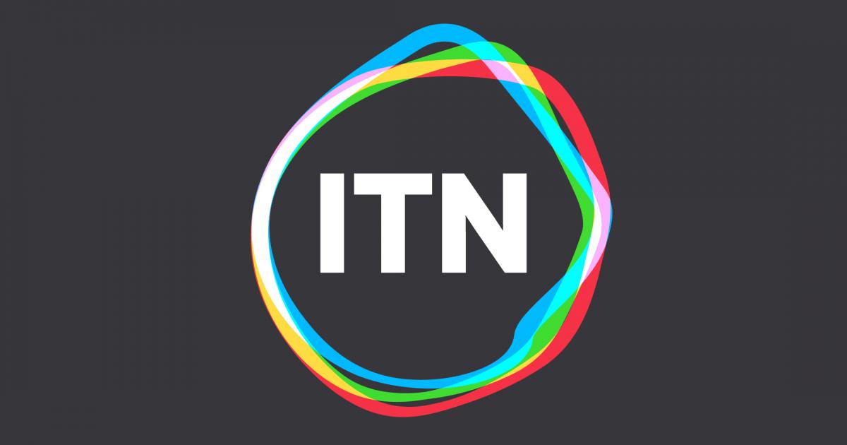
New ITN Branding

![[-]](https://pres.cafe/images//collapse.png) The following 7 users Like bilky asko's post:
The following 7 users Like bilky asko's post:• Former Member 406, harshy, Ma76, Pips2022, Rijowhi, Stuart, turbolazer
30-11-2022, 07:51 PM
Really like. Very fresh. It’s better in colour and animated.
Would love to see a full ITN branded bulletin.
Would love to see a full ITN branded bulletin.
30-11-2022, 08:03 PM
If this logo was to be used at the start of all News bulletins on ITV and Channel 4 like they used to be, I’d say it’s weak. However, the only time we see it now is at the end of ITN productions, notably the news on Channel’s 4 and 5, and the logo is sufficient for that. It’s neat and simple. Like Phil’s comment on the first page, the current BT logo springs to mind.
It’s a shame they’ve ditched the bold logo they’ve used for so long, but the ITN we have now is simply not that of even 20 years ago. It’s a content supplier for other broadcasters and its logo no longer dominates its content like it used to.
It’s a shame they’ve ditched the bold logo they’ve used for so long, but the ITN we have now is simply not that of even 20 years ago. It’s a content supplier for other broadcasters and its logo no longer dominates its content like it used to.
The following 5 users Like nwtv2003's post:• chrisherald, Former Member 406, Mixdown, Rijowhi, Roger Darthwell
30-11-2022, 08:11 PM
To be honest it looks like someone has spent 5 minutes making it in After Effects.
The following 5 users Like Humphrey Hacker's post:• chrisherald, Ma76, Mixdown, Roger Darthwell, Stuart
30-11-2022, 08:34 PM
The following 8 users Like fanoftv's post:• chrisherald, DE88, Former Member 406, GMc, Ma76, Mixdown, thomalex, watchingtv
01-12-2022, 02:02 AM
I like it.
It is quite a big rebrand from a company that has relatively stayed in the background, so its definitely gonna have a lot of time getting used to by the public. Also, the usage of a reactionary logo is a bit interesting, as it reminds me of AFP's 2020 logo and the concept of a revolving globe. Additionally, this logo reminds me of Reuters' major rebrand, when Reuters went with a dotted spiral motif inspired by its past, and ITN, still has a link to the past, through the use of the line, now seperated from the wordmark.
Here is more from Undivided, one of the companies that worked on the ITN rebrand:
www.undivided.co
"Please stand by for further details, as we return you now to your regularly scheduled program. Hopefully."

01-12-2022, 07:08 PM
It's not like the old logo was visually inspired either. It's certainly modern and follows modern trends. The fact it's not a perfect circle does help, but the typeface is passively modern (New Pres Term- Passively Modern: not meant to draw attention but to fit into current trends)
I like the old ITN logo and all, but...really? As I said, that logo wasn't really good either. It was too solid and if you shrunk it, the gaps would vanish. The 2006 modernisation just looked ugly. I think that its an improvement, personally.
(30-11-2022, 11:55 AM)JK08 Wrote: A shame to see a solid logo which rooted back 53 years replaced with... this.
I like the old ITN logo and all, but...really? As I said, that logo wasn't really good either. It was too solid and if you shrunk it, the gaps would vanish. The 2006 modernisation just looked ugly. I think that its an improvement, personally.
![[Image: SAD%20BLU2.png]](https://up.metropol247.co.uk/Blewatter/SAD%20BLU2.png)
01-12-2022, 09:12 PM
The yellow logo used in the seventies and eighties was iconic. The blue added to it in the nineties didn’t really improve it.
After that it changed and the typeface went a bit thicker, and the yellow was lost. It’s been poor since then, this is an improvement over that.
After that it changed and the typeface went a bit thicker, and the yellow was lost. It’s been poor since then, this is an improvement over that.
01-12-2022, 09:58 PM
(01-12-2022, 09:12 PM)Scrotnig Wrote: The yellow logo used in the seventies and eighties was iconic. The blue added to it in the nineties didn’t really improve it.
After that it changed and the typeface went a bit thicker, and the yellow was lost. It’s been poor since then, this is an improvement over that.
Is ITN even a recognised brand these days in the eyes of the public? it was quite obvious a few years ago when it was itn news on itv, but you would only notice if you looked closely on the end boards these days.
01-12-2022, 10:08 PM
(01-12-2022, 09:58 PM)harshy Wrote:(01-12-2022, 09:12 PM)Scrotnig Wrote: The yellow logo used in the seventies and eighties was iconic. The blue added to it in the nineties didn’t really improve it.
After that it changed and the typeface went a bit thicker, and the yellow was lost. It’s been poor since then, this is an improvement over that.
Is ITN even a recognised brand these days in the eyes of the public? it was quite obvious a few years ago when it was itn news on itv, but you would only notice if you looked closely on the end boards these days.
I doubt most people know who they are these days.
I rue the day the ITN brand was dropped from what is now itv News. It lacks authority.
I’d love to see it come back using this new logo front and centre. Obviously that’s no more likely than the old regional itv names coming back but I can dream.
« Next Oldest | Next Newest »
Users browsing this thread: 1 Guest(s)