Posts: 766
Threads: 11
Likes Received: 901 in 562 posts
Likes Given: 553
Joined: Jul 2022
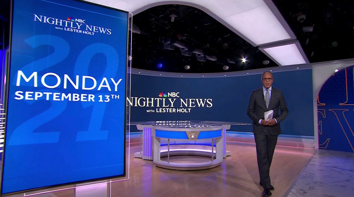
Perhaps a bit related: They celebrated their 75th year on the air last night, with a small hint of "the studio will look a little different" on Monday:
youtu.be
Not sure if that means the rebrand or a new set, or both.
Watch this space...
WestKnightTV - on DeviantArt
(This post was last modified: 17-06-2023, 03:03 PM by
W. Knight.)
Posts: 578
Threads: 12
Likes Received: 680 in 388 posts
Likes Given: 1,231
Joined: Jul 2022
(17-06-2023, 03:03 PM)W. Knight Wrote: Perhaps a bit related: They celebrated their 75th year on the air last night, with a small hint of "the studio will look a little different" on Monday:
Not sure if that means the rebrand or a new set, or both.
It is the rebrand, for sure. Additionally, the set is still somehow new: they moved to Studio 1A since September 2021 (when they did its current refit) and it has a lot of video walls and visual technology (inherited from Today) that would eventually make a quick set design change effortless.
www.newscaststudio.com
Posts: 637
Threads: 0
Likes Received: 2,336 in 483 posts
Likes Given: 404
Joined: Jul 2022
Today set so does not suit it. Kinda cheapens that iconic place and the whole ice cave look was bad from the start.
Posts: 766
Threads: 11
Likes Received: 901 in 562 posts
Likes Given: 553
Joined: Jul 2022
Here's Lester Holt teasing the new look (not studio!):
www.instagram.com
Suspect the 'domino Ns' in the background is what the opening sequence will look like.
[Update] Headline teaser:
youtu.be
Watch this space...
WestKnightTV - on DeviantArt
(This post was last modified: 19-06-2023, 11:10 PM by
W. Knight.)
Posts: 78
Threads: 0
Likes Received: 108 in 41 posts
Likes Given: 550
Joined: Jul 2022
Skip to 0:24. Thanks to "Kev's Media Archive" on YouTube.
(This post was last modified: 20-06-2023, 12:22 AM by
GMc.)
Posts: 23
Threads: 0
Likes Received: 93 in 18 posts
Likes Given: 156
Joined: Jan 2023
Well that's underwhelming. Very 2009.
Posts: 468
Threads: 3
Likes Received: 806 in 282 posts
Likes Given: 980
Joined: Jul 2022
A definite improvement: all the letters in the titles are properly aligned, it doesn't look like a rush job, and they've finally moved into this millennium by ditching the old fonts.
Posts: 3,611
Threads: 17
Likes Received: 5,841 in 1,902 posts
Likes Given: 2,627
Joined: Jul 2022
That makes the BBC headline sequence seem short and snappy.
(This post was last modified: 20-06-2023, 08:24 AM by
Brekkie.)
Posts: 468
Threads: 3
Likes Received: 806 in 282 posts
Likes Given: 980
Joined: Jul 2022
(20-06-2023, 08:24 AM)Brekkie Wrote: That makes the BBC headline sequence seem short and snappy.
1 minute and 20 seconds, which was quicker than last night's BBC News at Ten which was 1 minute 45 seconds (excluding regional headlines).
Posts: 458
Threads: 3
Likes Received: 1,103 in 287 posts
Likes Given: 111
Joined: Aug 2022
The typeface in the logo reminds me of Gotham which in my opinion is a bit passé now.
![[-]](https://pres.cafe/images//collapse.png)

 Source:
![[Image: 1592580878_1869298444.svg]](https://up.metropol247.co.uk/062020/1592580878_1869298444.svg)