Posts: 651
Threads: 0
Likes Received: 1,643 in 447 posts
Likes Given: 5,138
Joined: Oct 2022
Yes, now that you have reminded me that does ring a bell. Sorry, my mistake for conflating Reith generally with the blocks.
However, the rest of what is said in my last post still makes sense. If they wanted to tweak the logo to “match” Reith, they could have done it but used a custom variant of Reith to get around the small size legibility issues. Why they decided to update the logo but didn’t bother to do that, when as you point out the option to keep the old logo was also open to them, is beyond me.
Posts: 3,646
Threads: 17
Likes Received: 5,891 in 1,916 posts
Likes Given: 2,661
Joined: Jul 2022
For me the issue isn't the new logo at all - it's the fact the old logo is still hanging around. That makes the justifications around the new logo much more difficult to sell.
![[-]](https://pres.cafe/images//collapse.png) The following 12 users Like Brekkie's post:12 users Like Brekkie's post
• AndrewP, AverageOrangeTurnip, benzj, callumwatchestelly, chaose, DeMarkay, fanoftv, interestednovice, Jayesyn, Ma76, strollfan, UTVLifer
The following 12 users Like Brekkie's post:12 users Like Brekkie's post
• AndrewP, AverageOrangeTurnip, benzj, callumwatchestelly, chaose, DeMarkay, fanoftv, interestednovice, Jayesyn, Ma76, strollfan, UTVLifer
Posts: 543
Threads: 16
Likes Received: 1,040 in 319 posts
Likes Given: 7,012
Joined: Jul 2022
Have EastEnders even got around to updating the logo yet?
Posts: 50
Threads: 2
Likes Received: 177 in 39 posts
Likes Given: 0
Joined: Oct 2022
(19-04-2024, 09:01 AM)UTVLifer Wrote: Have EastEnders even got around to updating the logo yet?
No and I wouldn’t hold your breath. More chance of new opening titles than updated blocks.
Posts: 447
Threads: 3
Likes Received: 873 in 263 posts
Likes Given: 463
Joined: Jul 2022
My main question is... why? Surely there's somebody in charge of this stuff, who can send Elstree a quick email?
(Edited to add - I assume clean graphical elements for that title sequence still exist?)
(This post was last modified: 19-04-2024, 01:54 PM by
IanJRedman.)
Posts: 883
Threads: 2
Likes Received: 2,442 in 596 posts
Likes Given: 1,448
Joined: Oct 2022
I’m guessing here, but would the titles not have been made by an external company, or a different BBC department? If so, there’d probably be a charge for re-editing them. Maybe they don’t want to pay for something they never asked to be changed, and would rather keep the money for the production budget.
I’m thinking of a similar situation with the 2008 News At Ten titles which reportedly didn’t have versions made with the clock face showing times for when the programme was delayed because they were being charged too much money for new renders of the sequence, despite it being an apparently simple editing job.
Just a theory.
Posts: 253
Threads: 0
Likes Received: 531 in 159 posts
Likes Given: 308
Joined: Sep 2022
(19-04-2024, 01:45 PM)IanJRedman Wrote: My main question is... why? Surely there's somebody in charge of this stuff, who can send Elstree a quick email?
(Edited to add - I assume clean graphical elements for that title sequence still exist?)
It feels like the approach on everything from opening titles to channel branding has not been "spend some money to update it with the new logo now" but "next time you're going to spend some money to update it anyway, don't forget to change the logo".
Which is fair enough, really, I think that makes sense given the budgetary constraints and the similarity of the logo. Except that there have been quite a few examples of brand new things still having the old logo and I think we're so many years into it now that there probably ought to be a mopping-up exercise to change it on those higher-profile places it remains like EastEnders.
Posts: 651
Threads: 0
Likes Received: 1,643 in 447 posts
Likes Given: 5,138
Joined: Oct 2022
Indeed - and the entrance to NBH itself!
Posts: 1,531
Threads: 10
Likes Received: 1,721 in 720 posts
Likes Given: 1,677
Joined: Oct 2022
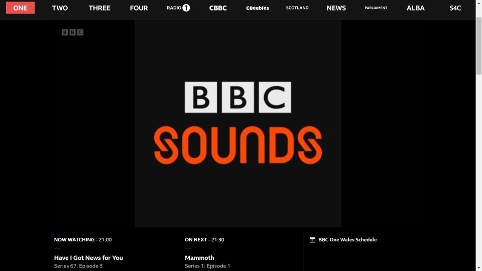
I doubt this was deliberate mocking of the BBC's branding strategy on Have I Got News For You, but the original BBC Sounds logo was brought back from the dead tonight (This was on screen during audio of a cock-up on Radio 2).
up.metropol247.co.uk
Posts: 1,027
Threads: 0
Likes Received: 1,931 in 613 posts
Likes Given: 2,485
Joined: Jul 2022
(19-04-2024, 02:29 PM)Transmission Wrote: It feels like the approach on everything from opening titles to channel branding has not been "spend some money to update it with the new logo now" but "next time you're going to spend some money to update it anyway, don't forget to change the logo".
Which is fair enough, really, I think that makes sense given the budgetary constraints and the similarity of the logo. Except that there have been quite a few examples of brand new things still having the old logo and I think we're so many years into it now that there probably ought to be a mopping-up exercise to change it on those higher-profile places it remains like EastEnders.
I think that's a common strategy. When Nationwide recently changed their logo they sent everyone an email and explained they were working through changing signs at individual branches.
However, they said if people were due a new card soon it may have the old logo, as they would use existing stocks first.