21-02-2023, 07:19 PM
The BBC Chameleon Thread
24-02-2023, 10:03 PM
I don't know how this happened, but earlier today, I accessed the BBC Branding assets and guidelines on BBC GEL without logging into a BBC Staff account, via a link on the BBC Webcore page of course.
I found these images while I was on the GEL website.
Black BBC logo
ichef.bbci.co.uk

White BBC logo
ichef.bbci.co.uk

Total Colour backgrounds (gradients)
ichef.bbci.co.uk

Lockups (Logo systems)
ichef.bbci.co.uk

Powerpoint Templates
ichef.bbci.co.uk

I found these images while I was on the GEL website.
Black BBC logo
ichef.bbci.co.uk
White BBC logo
ichef.bbci.co.uk
Total Colour backgrounds (gradients)
ichef.bbci.co.uk
Lockups (Logo systems)
ichef.bbci.co.uk
Powerpoint Templates
ichef.bbci.co.uk
![[-]](https://pres.cafe/images//collapse.png) The following 8 users Like BBCChameleonFan's post:
The following 8 users Like BBCChameleonFan's post:• bkman1990, JosiahStuart, Lyric, Ma76, mokked, SlimyTrain, Spencer, Spider
25-02-2023, 01:11 AM
Does anyone know why none of the BBC logos (expect for BBC Three) have been updated on the Virgin EPG? Including radio too!
25-02-2023, 08:33 AM
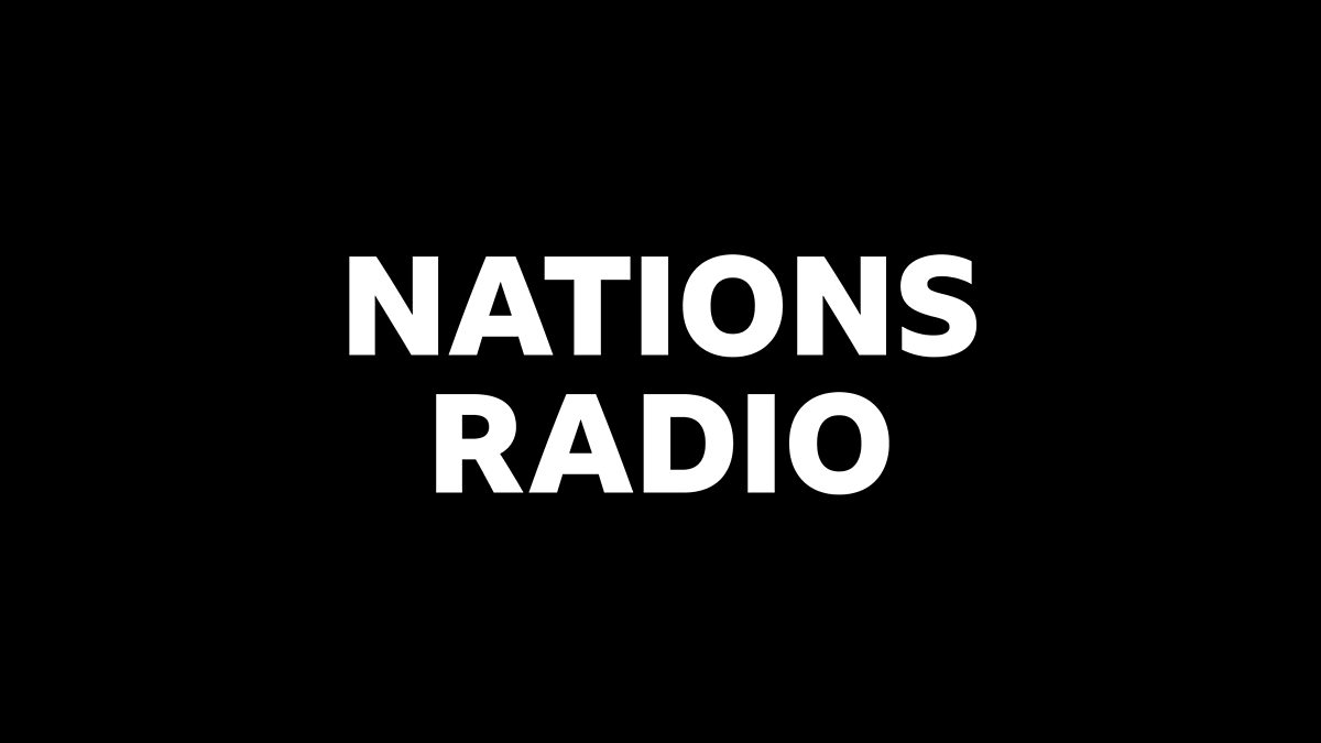
I found a page on BBC GEL that doesn’t require a BBC Staff login, which is the main page for the Nations Radio stations assets and guidelines.
www.bbc.co.uk
Sadly those require a BBC Staff login, but at least an image of the logo and branding for each radio station are there.
Using that, I noticed that Radio Nan Gaidheal uses the star once again, but in more premium detail, at least from the image anyway.
www.bbc.co.uk
Sadly those require a BBC Staff login, but at least an image of the logo and branding for each radio station are there.
Using that, I noticed that Radio Nan Gaidheal uses the star once again, but in more premium detail, at least from the image anyway.

25-02-2023, 06:31 PM
So, going by the "BBC HORIZONTAL" template, does that mean the BBC are already breaking their own branding guidelines, and BBC THREE and FOUR have such large text beside the BBC logo? Shouldn't they be the same as BBC Scotland? I wonder why the DOGs aren't 'BBC STANDARD' anyway, or BBC SHRT (which I read as BBC SHIRT at first!) I think they'd look better on screen stacked than all in one line.
26-02-2023, 03:59 PM
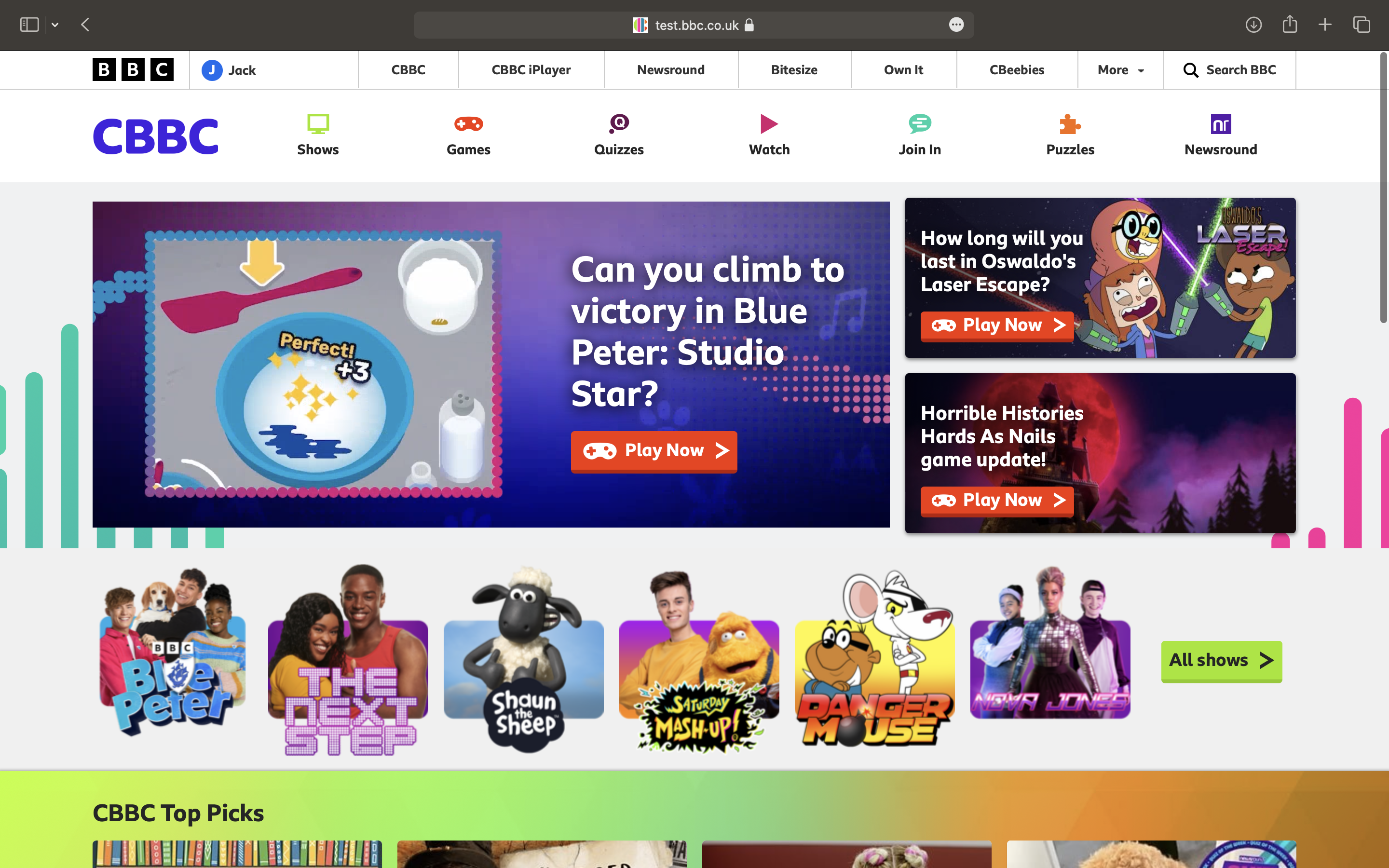
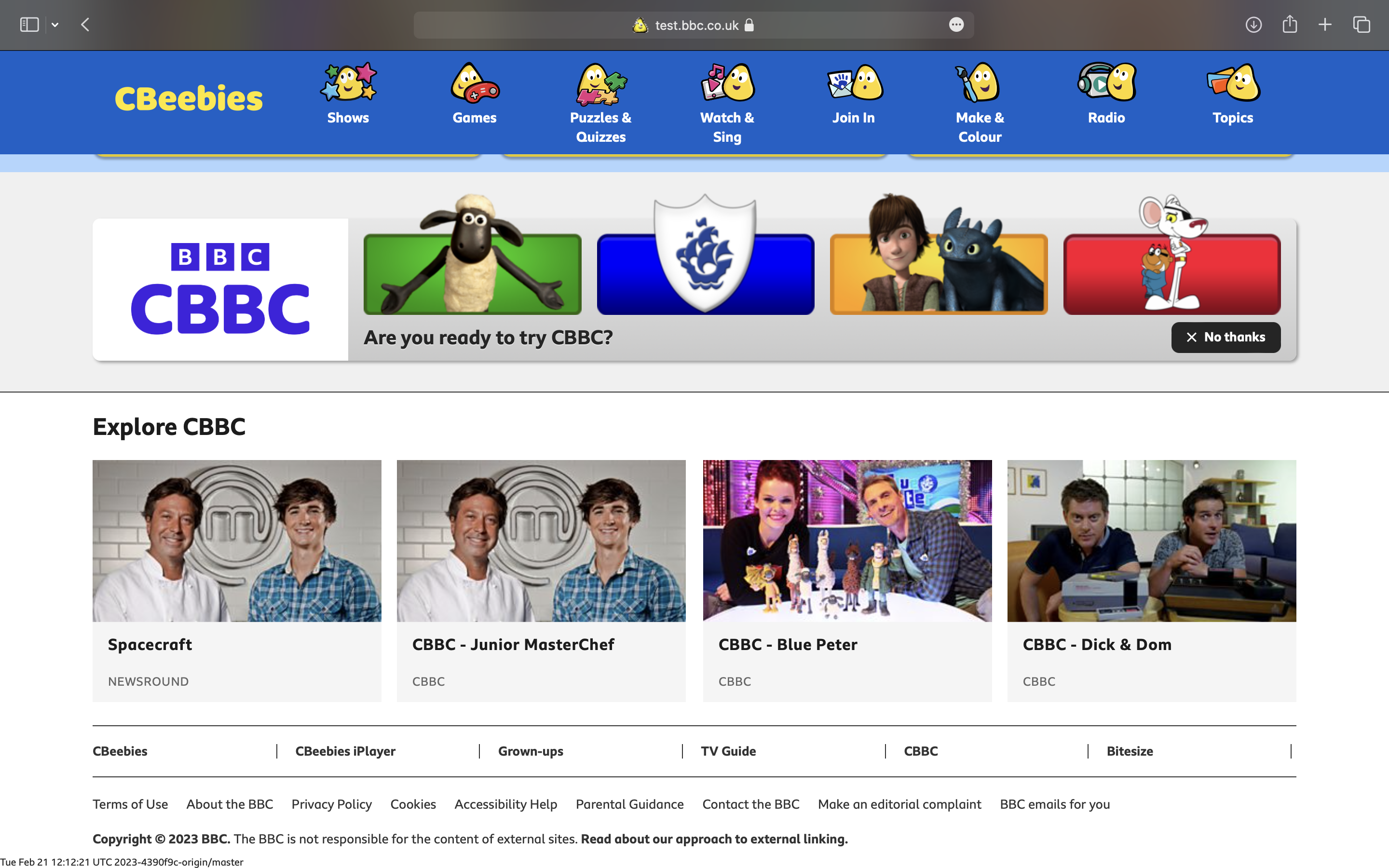
CBBC and CBeebies Test pages have been updated with the new logos, but not like what we've seen before! Looks like the plan to keep the original logos but with the new BBC logo has been cancelled, and going with a completely unexpected new look, with the new BBC logo and branding in mind. I like the CBeebies one, but CBBC? Let's just say that the previous logo was better than that.
CBBC
up.metropol247.co.uk
CBeebies
up.metropol247.co.uk
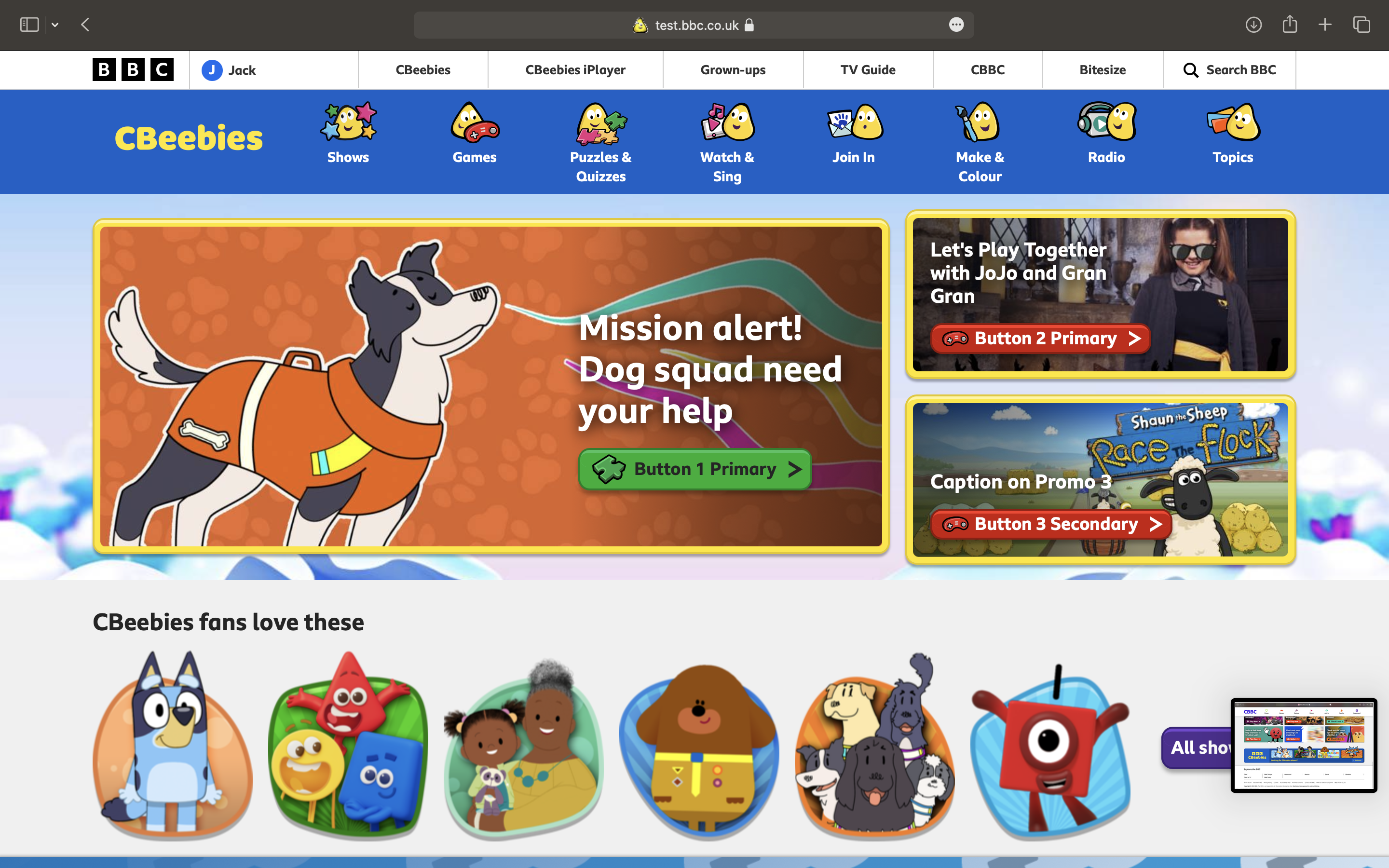
Full logos at the bottom of each page.
up.metropol247.co.uk
up.metropol247.co.uk
CBBC
up.metropol247.co.uk
CBeebies
up.metropol247.co.uk
Full logos at the bottom of each page.
up.metropol247.co.uk
up.metropol247.co.uk

26-02-2023, 04:28 PM
The CBeebies one does look believable, the letters are slightly shifted in angles (except for in the main navbar) and it was due an update as the CBeebies logo looked a little like it was frowning with the BBC logo now at the top rather than the bottom.
If that's the new CBBC logo, then I guess we'll be getting new idents alongside it, I thought they would've just updated the pre-existing idents to use the now familiar Chameleon system. It does look like a new rounded version of Reith Sans.
If that's the new CBBC logo, then I guess we'll be getting new idents alongside it, I thought they would've just updated the pre-existing idents to use the now familiar Chameleon system. It does look like a new rounded version of Reith Sans.
The following 5 users Like Allanbuzzy's post:• BBCChameleonFan, bkman1990, interestednovice, Roger Darthwell, SlimyTrain
26-02-2023, 04:56 PM
Is that the same font as BBC Kids being used for CBeebies?
26-02-2023, 05:09 PM
(26-02-2023, 03:59 PM)BBCChameleonFan Wrote: CBBC and CBeebies Test pages have been updated with the new logos, but not like what we've seen before! Looks like the plan to keep the original logos but with the new BBC logo has been cancelled, and going with a completely unexpected new look, with the new BBC logo and branding in mind. I like the CBeebies one, but CBBC? Let's just say that the previous logo was better than that.These logos are VERY generic imo.
CBBC
up.metropol247.co.uk
CBeebies
up.metropol247.co.uk
Full logos at the bottom of each page.
up.metropol247.co.uk
up.metropol247.co.uk
The following 6 users Like JoshieTrue's post:• BBCChameleonFan, bkman1990, chris, DeMarkay, interestednovice, Ma76
26-02-2023, 05:09 PM
(26-02-2023, 04:28 PM)Allanbuzzy Wrote: If that's the new CBBC logo, then I guess we'll be getting new idents alongside it, I thought they would've just updated the pre-existing idents to use the now familiar Chameleon system. It does look like a new rounded version of Reith Sans.Indeed it does, like the font used for Children in Need.
When I saw that CBBC logo, it looked ugly at first, because I did not want a CBBC logo that said BBC twice and in the same font as the masterbrand BBC logo, but if it's rounded, then I'll make that an exception. But when I got used to the logo, it's actually not bad, but it could've been improved a bit.
« Next Oldest | Next Newest »
Users browsing this thread: 7 Guest(s)