Posts: 905
Threads: 0
Likes Received: 1,735 in 459 posts
Likes Given: 1,076
Joined: Jul 2022
I am trying to remember what other companies promote themselves with two logos.
Posts: 244
Threads: 2
Likes Received: 475 in 148 posts
Likes Given: 1,439
Joined: Jul 2022
(06-02-2024, 08:00 PM)harshy Wrote: I am trying to remember what other companies promote themselves with two logos.
Speaking from personal perspective, Global has two logos. The blue lozenge with word mark underneath, and just a version with the wordmark.
Posts: 271
Threads: 0
Likes Received: 441 in 146 posts
Likes Given: 683
Joined: Aug 2022
(06-02-2024, 08:00 PM)harshy Wrote: I am trying to remember what other companies promote themselves with two logos.
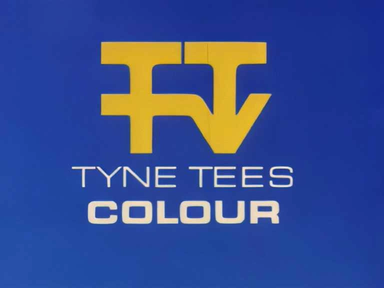
Didn't Tyne Tees promote themselves with two logos from 1999-2002?
And Halfords.
(This post was last modified: 06-02-2024, 08:13 PM by
Juicy Joe.)
Posts: 1,001
Threads: 2
Likes Received: 763 in 375 posts
Likes Given: 73
Joined: Jul 2022
2000-2002, yes. Tyne Tees's new local idents weren't introduced on the same day as the 1999 generics like Yorkshire's. But when they did introduce the new local ident the following year, they didn't update the generic one, resulting in them having two logos until the 2002 rebrand, at which point the 1998 logo vanished. The 2000 logo lasted a couple more years on the endcaps before biting the dust alongside the iconic chevron and G-arrow logos.
(This post was last modified: 06-02-2024, 08:24 PM by
JAS84.)
Posts: 1,041
Threads: 0
Likes Received: 1,970 in 623 posts
Likes Given: 2,543
Joined: Jul 2022
(06-02-2024, 08:10 PM)Juicy Joe Wrote: Didn't Tyne Tees promote themselves with two logos from 1999-2002?
Yes, TTTV became something of a mess for the local viewer from 1996 onwards.
They'd upgraded to a rather nice silver/blue CGI ident in 1992, then came the disaster of C3NE. Instead of just reverting to the former ident/logo in 1998, they just couldn't make their mind up about either the colour, the font (serif/sans serif) or the design. The regional ident had something completely different surrounded by circles.
All quite bizarre with no consistency between their regional and national identity.
The following link is for hilarity purposes:
 logos.fandom.com
Posts: 201
Threads: 0
Likes Received: 573 in 126 posts
Likes Given: 141
Joined: Jul 2022
ichef.bbci.co.uk
We're going back to 1997 on the BBC News webpage today.
Fortunately the actual podcast has the new logo but someone made this very recently!
Posts: 42
Threads: 0
Likes Received: 152 in 29 posts
Likes Given: 174
Joined: Sep 2023
(09-01-2024, 06:56 PM)Brekkie Wrote: I knew it was cold today but didn't realise hell had frozen over. See they didn't manage to update the titles though, so maybe next year.
Wednesday brought about some good news

Posts: 227
Threads: 0
Likes Received: 729 in 180 posts
Likes Given: 22
Joined: Oct 2022
(08-02-2024, 02:51 PM)thomalex Wrote: ichef.bbci.co.uk
We're going back to 1997 on the BBC News webpage today.
Fortunately the actual podcast has the new logo but someone made this very recently!
I’m on sounds at the moment and just notice that the that when you’re playing the podcast there are 4 little rectangles bobbing up and down showing the podcast is being played. Why four and not three? Surely when you’re apps icon is three orange rectangles it would make sense to have three? Nit picking but it’s the silly little things like that which when looking at branding make the difference. Id see three and in my head go if they’ve thought of that they’ve thought of everything.
The other thing, I makes my head hurt that they don’t put the word radio on the podcast image as it just makes it look uneven. Also its name is bbc radio 4, not just bbc 4. I think I can see what the idea is. All radio stations are circles with the number in so let’s take the word radio away. Just looks odd IMHO
Just a ident loving pres.fan from the East of England
All spelling mistakes are my own #Dyslexic@Keyboard
Posts: 1,572
Threads: 10
Likes Received: 1,792 in 746 posts
Likes Given: 1,726
Joined: Oct 2022
(09-02-2024, 06:44 PM)ViridianFan Wrote: I’m on sounds at the moment and just notice that the that when you’re playing the podcast there are 4 little rectangles bobbing up and down showing the podcast is being played. Why four and not three? Surely when you’re apps icon is three orange rectangles it would make sense to have three? Nit picking but it’s the silly little things like that which when looking at branding make the difference. Id see three and in my head go if they’ve thought of that they’ve thought of everything.
The other thing, I makes my head hurt that they don’t put the word radio on the podcast image as it just makes it look uneven. Also its name is bbc radio 4, not just bbc 4. I think I can see what the idea is. All radio stations are circles with the number in so let’s take the word radio away. Just looks odd IMHO
When there was buffering for me on iPlayer earlier, there was three squares on screen. So it possible for somewhere in the BBC to have that joined up thinking.
Agree with the radio naming on the programme images, I know it doesn't have the number in circle logo, but the word radio is included on some programme images for BBC Radio Wales, and that works okay I would say.
ichef.bbci.co.uk
(This post was last modified: 09-02-2024, 11:42 PM by
RhysJR.)
Posts: 227
Threads: 0
Likes Received: 729 in 180 posts
Likes Given: 22
Joined: Oct 2022
(09-02-2024, 11:37 PM)RhysJR Wrote: When there was buffering for me on iPlayer earlier, there was three squares on screen. So it possible for somewhere in the BBC to have that joined up thinking.
Agree with the radio naming on the programme images, I know it doesn't have the number in circle logo, but the word radio is included on some programme images for BBC Radio Wales, and that works okay I would say.
ichef.bbci.co.uk
I just makes me laugh at how poorly executed the whole thing is. There’s so little consistency. It annoys me how when you open iplayer you get the animation but you don’t on any other of the apps. The icons are just totally pointless. It’s clear someone said google have different icons for their different services let’s do that. It wouldn’t be as bad if they were used for everything, they’d need to improve them slightly but at least it would be consistent.
(09-02-2024, 11:37 PM)RhysJR Wrote: Agree with the radio naming on the programme images, I know it doesn't have the number in circle logo, but the word radio is included on some programme images for BBC Radio Wales, and that works okay I would say.
ichef.bbci.co.uk
Doesn’t that look so much better. It’s another reason why just having the circled number doesn’t work as not all radio stations use it. If you just had the bbc blocks at the bottom too it would be much better.
The biggest problem with this rebrand is there are too many variations. The reason the 1997 branding worked and to a degree the coloured boxes worked (except that they’d always use the wrong one for bbc one) was it was one logo used everywhere. Whereas this branding system seems to have so many different versions used in different applications. It feels like people aren’t always sure which one to use so kind of make it up a bit.
The other big issue is the font. BBC reith is great for what it was designed for. A good body text font which is easy to read on screen and print but all the things which make it a great font for reading (simple, easy to read, use influences from all the default go to fonts) means it doesn’t catch your attention, it merges into the background, it looks very generic. They needed a variation of it which stands out more for the logo which looks higher quality
Just a ident loving pres.fan from the East of England
All spelling mistakes are my own #Dyslexic@Keyboard


![[-]](https://pres.cafe/images//collapse.png) The following 6 users Like ViridianFan's post:
The following 6 users Like ViridianFan's post: