Posts: 517
Threads: 1
Likes Received: 544 in 225 posts
Likes Given: 129
Joined: Jul 2022
(13-02-2024, 08:21 PM)Mixdown Wrote: www.youtube.com
For those who haven't seen it - a 2014 visit to Lenton Lane/Kings Meadow. Annoyingly, it has been reuploaded in a picture-in-picture format but I originally came across this on TV Forum. The visit to the Anglo American vehicles company about half way through - the last part of the old operation still on site - is a particular highlight.
Still there in Dec 2021. Always wondered how many of them were/are runners...
![[Image: signature.jpg]](https://chatps.com/tonight/signature.jpg)
chatps.com
Posts: 232
Threads: 1
Likes Received: 291 in 127 posts
Likes Given: 50
Joined: Sep 2022
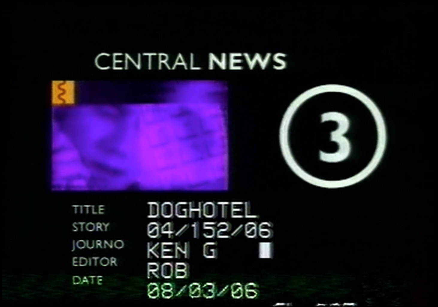
This may be of interest, though I cannot find the source - a Central News (West) VT clock from an SNG edited story, dated March 2006 that is (by that time) 7 styles out of date:
up.metropol247.co.uk
Surviving the Carltonisation, Dan Barton's numerous rebrands and the ITV plc corporate looks from 2004 and 2006. Posted it here as it seemed semi-relevant to the discussion, in so far as even the most rigidly enforced rebrands have stragglers that survive.
(This post was last modified: 14-02-2024, 06:38 AM by
Mike.)
Posts: 880
Threads: 2
Likes Received: 2,436 in 594 posts
Likes Given: 1,438
Joined: Oct 2022
(14-02-2024, 06:34 AM)Mike Wrote: This may be of interest, though I cannot find the source - a Central News (West) VT clock from an SNG edited story, dated March 2006 that is (by that time) 7 styles out of date:
up.metropol247.co.uk
Surviving the Carltonisation, Dan Barton's numerous rebrands and the ITV plc corporate looks from 2004 and 2006. Posted it here as it seemed semi-relevant to the discussion, in so far as even the most rigidly enforced rebrands have stragglers that survive.
Are you sure that’s from Central News West? I’m assuming Ken G is Ken Goodwin who was a Central News South reporter.
Clutching at straws here, but I seem to remember he was based in their office at Gloucester Docks. I’ve no idea if he still was by 2006, or indeed how long the Gloucester office lasted, but assuming he was, perhaps they never remembered to send the VT clock to Gloucester.
Or maybe it’s just a case that keeping branding on VT clocks, which wouldn’t normally be seen by the public, up to date wasn’t a priority.
Posts: 1,630
Threads: 3
Likes Received: 2,015 in 797 posts
Likes Given: 153
Joined: Jul 2022
Considering mechanical VT clocks with logos from the 50s and 60s were still being used in the 80s, it's not surprising if there wasn't seen to be any need to update electronic ones either. After all, as you said, it's not as if they're supposed to be seen on air.
Posts: 232
Threads: 1
Likes Received: 291 in 127 posts
Likes Given: 50
Joined: Sep 2022
(14-02-2024, 09:45 AM)Spencer Wrote: Are you sure that’s from Central News West? I’m assuming Ken G is Ken Goodwin who was a Central News South reporter.
Clutching at straws here, but I seem to remember he was based in their office at Gloucester Docks. I’ve no idea if he still was by 2006, or indeed how long the Gloucester office lasted, but assuming he was, perhaps they never remembered to send the VT clock to Gloucester.
Or maybe it’s just a case that keeping branding on VT clocks, which wouldn’t normally be seen by the public, up to date wasn’t a priority.
So I've found the package:
vimeo.com
While it is Ken Goodwin, the package (and the location of the subject) are from just north of Worcester and between there and Droitwich which may be why a CNS reporter was used, but it's still closer to Birmingham than Abingdon and Gloucester.
It's most likely the latter, but it does strike me as strange given that Carlton went to the effort of rebranding all VT clocks at Gas Street and Lenton Lane with 'Carlton Birmingham/Nottingham' legends rather than 'Central', while this is different as it's for the specific programme - you'd have thought that by 2006, ITV were using Avid (or similar) for reports on regional news and such a clock would be standardised.
Edit: I think it is a CNS VT clock now having seen the below Flickr page; CNW appear to have dropped the strange iconography (which they had used for their 1997 titles) by 2000.
Random aside, did anyone ever work out what the 'squiggle' was meant to signify on the CN titles in the late 90s?
www.flickr.com
(This post was last modified: 14-02-2024, 05:08 PM by
Mike.)
Posts: 25
Threads: 0
Likes Received: 62 in 14 posts
Likes Given: 101
Joined: Jan 2023
(14-02-2024, 05:04 PM)Mike Wrote: Random aside, did anyone ever work out what the 'squiggle' was meant to signify on the CN titles in the late 90s?
www.flickr.com
I thought it meant something like connections or contacting people. The part of the titles with the squiggle wasn't very clear in the 1997 CNW titles as the part was only some person's eyes and people walking behind frosted glass in the background.
(14-02-2024, 05:04 PM)Mike Wrote: So I've found the package: vimeo.com
That small section on the top left looks like the start of the 1998 CNW titles, but it has the odd squiggly symbol, something that I don't recall being on those titles as I think it was only Central South that were using the symbols during the Carlton squares era, so could that small section be part of an unused title sequence?

Posts: 35
Threads: 0
Likes Received: 26 in 11 posts
Likes Given: 9
Joined: Nov 2022
(14-02-2024, 05:31 PM)TVHead Wrote: I thought it meant something like connections or contacting people. The part of the titles with the squiggle wasn't very clear in the 1997 CNW titles as the part was only some person's eyes and people walking behind frosted glass in the background.
I *think* the squiggle is a stylised nose and lips? The first peak is the nose, and the bottom two are the lips.
Posts: 232
Threads: 1
Likes Received: 291 in 127 posts
Likes Given: 50
Joined: Sep 2022
(20-02-2024, 10:54 AM)IndigoTucker Wrote: I *think* the squiggle is a stylised nose and lips? The first peak is the nose, and the bottom two are the lips.
I thought that too, but it looks more like a landline telephone cord.
This thread inspired me to try and recreate some of the Central/Carlton branding from 1996/8 - I also realised that the 'A' in both is modified ever so slightly. I've tried 4 different cuts of Gill Sans and the cross bar is lower by a fraction than the respective logos.
(This post was last modified: 20-02-2024, 12:02 PM by
Mike.)
![[-]](https://pres.cafe/images//collapse.png)

 Source: