Posts: 4
Threads: 0
Likes Received: 1 in 1 posts
Likes Given: 2
Joined: Oct 2022
(10-08-2022, 10:44 PM)Andrew Wood Wrote: Good to hear a different voice on Dave, as I'm afraid I'm not a big fan of the regular announcer's style.
However, the audio quality of the female announcer's continuity makes it sound like it's been recorded in a box. It's not the highest quality which does seem unusual.
There have been other instances in which the audio quality is poor. I saw an ident from 2007 which had the same problem. I’m assuming it’s because some other continuity announcer is using the Dave recording booth, perhaps to record a promo voiceover?
Posts: 68
Threads: 2
Likes Received: 139 in 51 posts
Likes Given: 31
Joined: Jul 2022
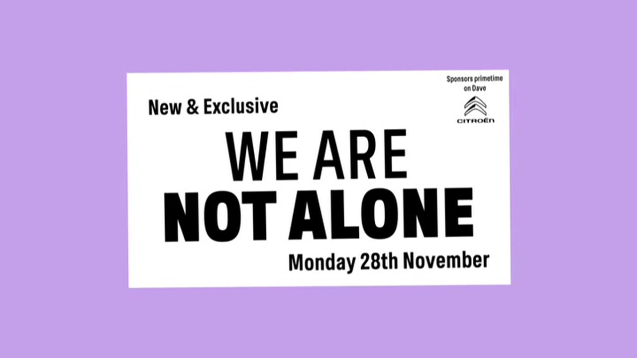
Slightly different promo style from Dave spotted last night in that it involves some of the new voice team. It starts off as a regular continuity announcement about 'tonight on Dave', before quickly being interrupted by aliens as part of a promotion for the upcoming comedy 'We Are Not Alone'. There are other variants showing them interrupting fake product ads too.
www.tvwhirl.co.uk
TV Whirl - Since 2001
Posts: 237
Threads: 16
Likes Received: 477 in 147 posts
Likes Given: 98
Joined: Aug 2022
Details about the presentation changes teased here last week have now been revealed:
twitter.com
Posts: 447
Threads: 20
Likes Received: 390 in 185 posts
Likes Given: 165
Joined: Aug 2022
Have they got the same person doing all the rebrands? Its like "W" I don't get them.
Posts: 173
Threads: 0
Likes Received: 286 in 96 posts
Likes Given: 124
Joined: Jul 2022
Chalkboard got old and tired quick ('old man pub' feel) which clashes with what they want to do (especially on social). So they're making it feel more flexible and dynamic. The continuity v/o refresh from the summer was the start of the change.
(This post was last modified: 08-11-2022, 12:12 PM by
dbl.)
![[-]](https://pres.cafe/images//collapse.png) The following 1 user Likes dbl's post:1 user Likes dbl's post
• UTVLifer
The following 1 user Likes dbl's post:1 user Likes dbl's post
• UTVLifer
Posts: 226
Threads: 2
Likes Received: 297 in 111 posts
Likes Given: 30
Joined: Jul 2022
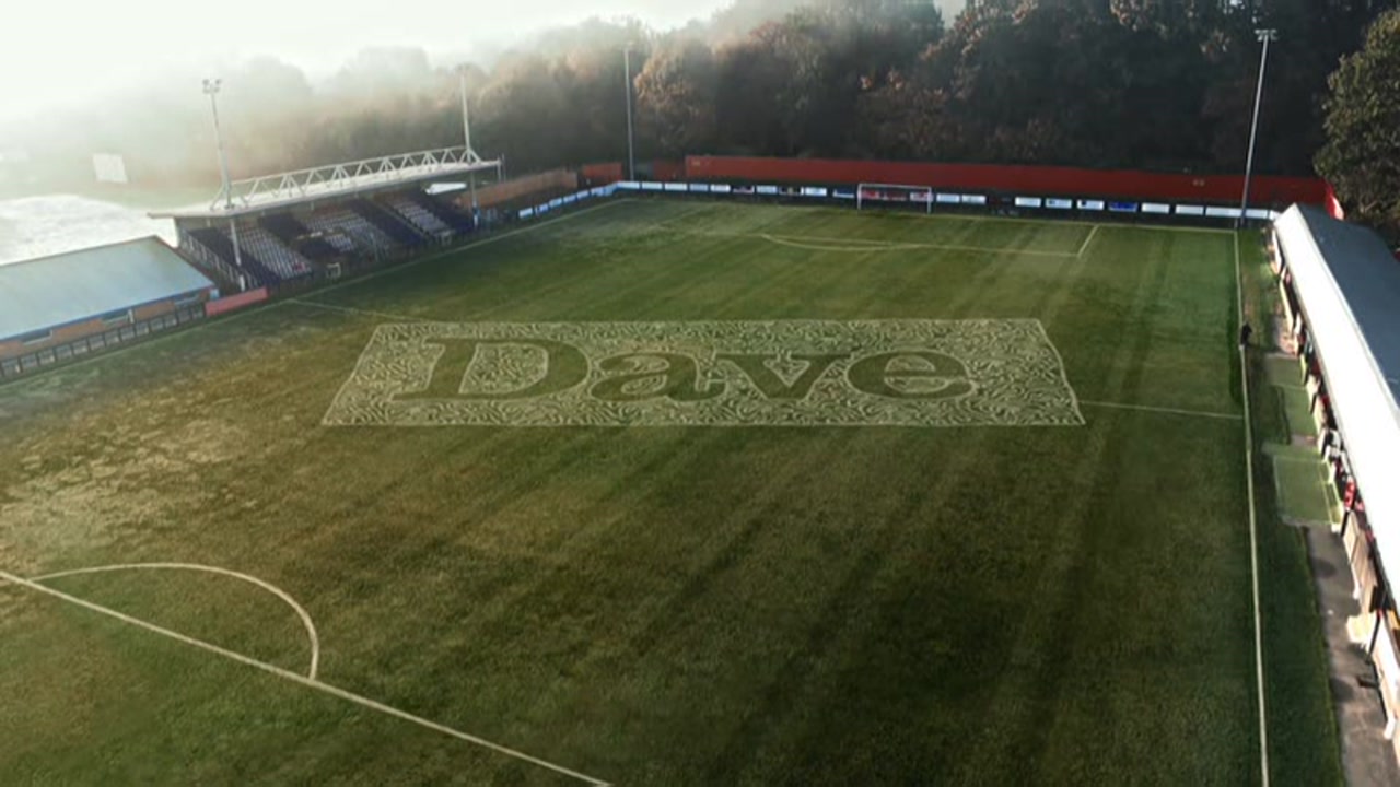
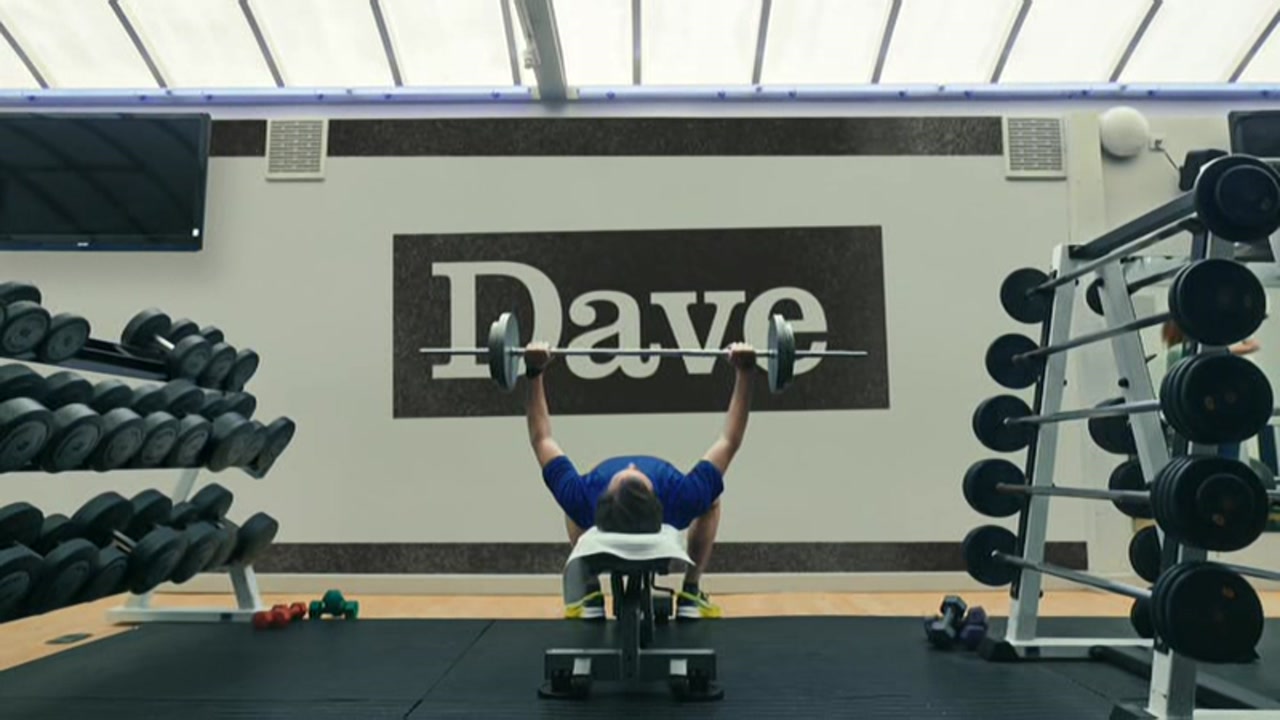
They box the logo, they unbox the logo, then box it again, all the while giving the usual marketing spiel about how it is better this way instead of the other way. The idents are an evolution of what has come before, so that's good. But the rest of it seems rather bland. The Dave logo over some knitting, some peanut butter, a snail... just what exactly does that say about the channel? I'm confused!
(This post was last modified: 08-11-2022, 02:29 PM by
rick.)
Posts: 9
Threads: 0
Likes Received: 4 in 4 posts
Likes Given: 45
Joined: Oct 2022
Looks like "Add a Bit of Dave" is the new slogan for the network. Interesting because they used that for the campaign they did back at March.
Posts: 11
Threads: 0
Likes Received: 24 in 6 posts
Likes Given: 16
Joined: Oct 2022
I agree that the older presentation needed an evolution but this looks quite generic and too similar to what they did with W. One of Dave's biggest attributes is the channel's personality, which arguably is part of why it became such a success - I don't get much of that from the break bumpers and endcaps. What I've seen of the idents does have that signature Dave feel, and I'm glad they kept the original logo in some form, but otherwise the package feels like bits from the W package, bits that could easily fit on Gold or even 2013 era Really.
Posts: 36
Threads: 1
Likes Received: 14 in 7 posts
Likes Given: 1
Joined: Oct 2022
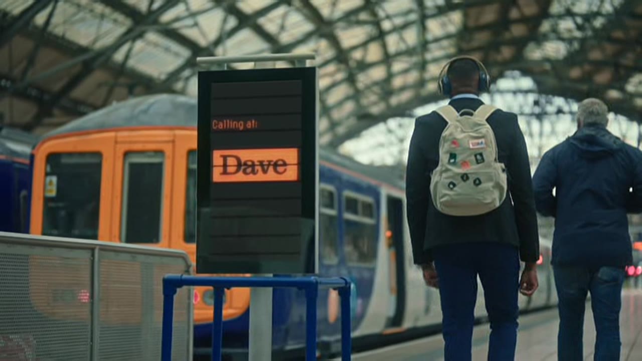
Just seen the train station ident. It lacks something. I think if it had background noises or music it would be better.
(This post was last modified: 09-11-2022, 10:24 AM by
Admin PC.)
Posts: 68
Threads: 2
Likes Received: 139 in 51 posts
Likes Given: 31
Joined: Jul 2022
Early coverage of some of the new idents for Dave from this morning (short daytime/off peak only versions at the moment as usual, so a we won't get the full playouts of all the variants until later on today when the peak playout starts) as well as other pres elements can be found here.
www.tvwhirl.co.uk
I'll be adding to this over the course of the day as new stuff airs, particularly the longer idents with more action in them, later today.
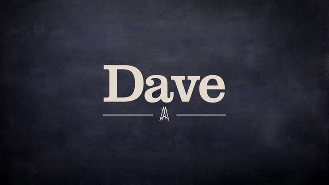
Some images:-
Image
Image
Image
And just for the oldskool TV Forumers, have a picture of a train:-
Image
TV Whirl - Since 2001
(This post was last modified: 09-11-2022, 02:35 PM by
TesTVWhirl.)