Posts: 363
Threads: 5
Likes Received: 714 in 215 posts
Likes Given: 312
Joined: Jul 2022
I know this is the entire point of a rebrand, but it just doesn't feel very Dave at all I'm almost inclined to say this is the kind of presentation E4 should've adopted when they rebranded, instead of inexplicably cloning ITV2.
Posts: 8
Threads: 0
Likes Received: 16 in 4 posts
Likes Given: 2
Joined: Oct 2022
The ECP / Menu animations remind me of a Jackbox game for some reason. Bumps seem okay. I like the flexible idents, it's like the E4 Eefer idents without the private parts
(This post was last modified: 10-11-2022, 08:37 PM by
kianworld.)
Posts: 223
Threads: 0
Likes Received: 483 in 150 posts
Likes Given: 320
Joined: Aug 2022
It’s very odd. It’s just not convincing me as a smooth transition for the repositioning of the channel. It had that witty and charming feeling to it before and it felt quite warm and inviting.
Don’t get me wrong, it all looks very nice and clean - but it’s also the TV channel equivalent of seeing your Dad go through a midlife crisis and start shopping at Topshop to get down with the kids. It’s very much giving the vibe of mutton dressed as lamb, and know their programming has changed and their audience is changing too - but the channel is called Dave for christ sake. Don’t go nuclear on the charm of it - it should’ve been had a good balance. A nice in-between of this and the previous branding would’ve worked perfectly.
Posts: 245
Threads: 18
Likes Received: 262 in 128 posts
Likes Given: 38
Joined: Jul 2022
Sad fact: The train ident was filmed on Platform 5 of Liverpool Lime Street Station, I think. I am not sure, but my experience there tells me it is. As it goes, the new Dave idents look fine. Nothing mindblowing, or particularly bad. I do miss the musical theme. I do think that the refresh is a good thing though. For many years, its been the 'Top Gear Channel', so it will be nice to see it find more of its own identity.
Looking at that UKTV ident, Alibi and Eden are the only two channels that still use the circle logo from launch. I can imagine that they will eventually rebrand.
Posts: 52
Threads: 2
Likes Received: 87 in 37 posts
Likes Given: 31
Joined: Jul 2022
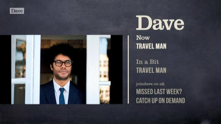
Ah, the old luck of what comes up in the schedules sometimes. One of the shows scheduled within the first 24 hours last night was a repeat of Meet The Richardsons, which has this mocked up channel graphic baked into the programme itself.
www.tvwhirl.co.uk
Just for those who were worried that the chalkboard may actually die that quick!

TV Whirl - Since 2001
(This post was last modified: 10-11-2022, 11:02 PM by
TesTVWhirl.)
Posts: 10
Threads: 0
Likes Received: 10 in 5 posts
Likes Given: 16
Joined: Oct 2022
(10-11-2022, 08:51 PM)Blubatt Wrote: Sad fact: The train ident was filmed on Platform 5 of Liverpool Lime Street Station, I think. I am not sure, but my experience there tells me it is. As it goes, the new Dave idents look fine. Nothing mindblowing, or particularly bad. I do miss the musical theme. I do think that the refresh is a good thing though. For many years, its been the 'Top Gear Channel', so it will be nice to see it find more of its own identity.
Looking at that UKTV ident, Alibi and Eden are the only two channels that still use the circle logo from launch. I can imagine that they will eventually rebrand.
Alibi did get an updated logo in 2015 (albeit still circular) along with the red string idents - which just reminds me how much I like those idents...
Posts: 255
Threads: 9
Likes Received: 395 in 144 posts
Likes Given: 114
Joined: Jul 2022
A further ident added to the new set - 'Woodland'. A more solemn ident, but also fitting to introduce 'Outsiders'.
tig.gy
Posts: 458
Threads: 3
Likes Received: 1,103 in 287 posts
Likes Given: 111
Joined: Aug 2022
I’ve been watching Dave a bit recently, it really feels like it’s lost a large chuck of personality. The witty break stings for example have been dropped for odd variations of the name being misspelled (e.g. “Date) and then re typed to Dave. It seems like such a big mistake and I’m not sure it was necessary at all.
Posts: 133
Threads: 0
Likes Received: 226 in 74 posts
Likes Given: 110
Joined: Jul 2022
(19-11-2022, 09:04 PM)VMPhil Wrote: I’ve been watching Dave a bit recently, it really feels like it’s lost a large chuck of personality. The witty break stings for example have been dropped for odd variations of the name being misspelled (e.g. “Date) and then re typed to Dave. It seems like such a big mistake and I’m not sure it was necessary at all.
They haven't been dropped, it's just not ready yet
Posts: 2
Threads: 0
Likes Received: 2 in 1 posts
Likes Given: 1
Joined: Nov 2022
Well I must say I think they have done a good job with them. Much better than what ITV have come up with. Dave V1 was the best set but I think this is an improvement from the previous set. The menus and previews are very slick.
(This post was last modified: 20-11-2022, 01:33 AM by
Admin PC.)

![[-]](https://pres.cafe/images//collapse.png)
![[Image: SAD%20BLU2.png]](https://up.metropol247.co.uk/Blewatter/SAD%20BLU2.png)

