Posts: 766
Threads: 11
Likes Received: 901 in 562 posts
Likes Given: 553
Joined: Jul 2022
Alongside some other concepts of this...
www.flickr.com
www.flickr.com
www.flickr.com
Now that these existed, the purple GMG endcaps make more sense to me.
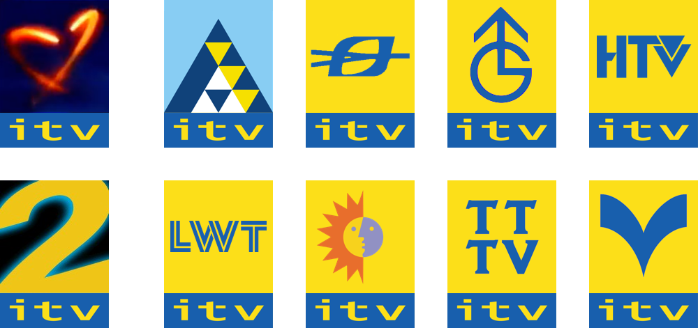
Re: TTTV. The mast made me think of the KCTV one in Kansas City around 1999; pretty crazy to see them building
another new symbol to replace the Helvetica 3 in C3NE. The mast model here looked a bit similar to this though...
![[Image: OKTANE__GRANADA_DIGITAL-1.png]](https://up.metropol247.co.uk/Knight%20in%20West/OKTANE__GRANADA_DIGITAL-1.png)
(from here)
Great find, Michael.
Watch this space...
WestKnightTV - on DeviantArt
(This post was last modified: 26-03-2023, 09:29 PM by
W. Knight.)
Posts: 140
Threads: 2
Likes Received: 364 in 123 posts
Likes Given: 139
Joined: Jul 2022
I think the interesting thing about these discoveries is that VMPhil's concepts for a fictional 1998 rebrand look eerily identical (if not, in concept) to these. I guess ITV originally WERE going to use a block system akin to their new digital sister channel ITV2.
www.tvforum.co.uk
Posts: 322
Threads: 0
Likes Received: 492 in 186 posts
Likes Given: 94
Joined: Jul 2022
Quite an interesting find. It’s well known Yorkshire had its own in house graphics team which did design a lot of the idents and logos from that era, which were also used for Tyne Tees, and to a lesser extent, Granada. I wonder if a number of the logos/slides on that Flickr page were created by them? I’m curious as to why there’s a Purple Granada endcap for UNM designed.
Posts: 458
Threads: 3
Likes Received: 1,104 in 287 posts
Likes Given: 111
Joined: Aug 2022
Very interesting, I'm curious as to why there's a T4 graphic in amongst them. And interesting to see widescreen versions of the idents going all the way back to the March 1998 TTTV ident.
Posts: 249
Threads: 3
Likes Received: 371 in 135 posts
Likes Given: 223
Joined: Jul 2022
Digging around on that Dexters Tech Lab page.
First. I Remember this from somewhere. I think as a promotional still. But would love to know if there was ever an actual ident created.
![[Image: 26189937368_1b0cc165d2.jpg]](https://live.staticflickr.com/4675/26189937368_1b0cc165d2.jpg)
52_GRANADA by Dexters Tech Lab, on Flickr
Second, was this attached to an actual ITV Division as I don't recognise the logo?
![[Image: 39164371835_198d92780a.jpg]](https://live.staticflickr.com/4769/39164371835_198d92780a.jpg)
75_ITV_CMYK by Dexters Tech Lab, on Flickr
Posts: 52
Threads: 2
Likes Received: 87 in 37 posts
Likes Given: 31
Joined: Jul 2022
It's a nice find, especially seeing some of the widescreen versions of stuff that never got broadcast in that form actually exist. Of course I'm sure everyone is going to sit dissecting and posting images one by one regardless, because we are all not capable of following the link on the previous page, but I would still suggest tempering your expectations of what some of this means somewhat. A lot of these graphics will never have been intended to make it to air so in that sense you could call them unused, but the words 'Tyne Tess Television' likely made it to a graphic too in error at some point (it did for their Teletext pages after all) so would that still be considered unused.

YTV had it's own in-house design department (Ballistix was the final name as I recall) who will have had to fill time doing things as they won't have been creating production graphics 100% of the time, especially once most of the promo creation moved south after 1998. Some will have been just been playing about with ideas. Some will have been examples of the sort of work they could do for pitches for other departments. Some are the deliberate duds that you always include in design pitches - company execs always want to see 3 or 4 ideas just to think they're getting value, so if you have one really good one you often have to knock something up no one would ever pick to pad out your deck (or so you hope anyway... Execs can sometimes go and pick the one you really didn't want them to so you have to be really careful
). And then don't forget there are people involved here too with careers to look out for. Some will have been people shoring up examples for portfolios as they'd no doubt have seen the writing on the wall for Ballistix long before it closed. And then of course any new people, juniors and interns need training up on tools and skills, so often may either be playing about with assets or have been set filler tasks by a senior just for practice. None of this would be intended for broadcast, and may also include random none existent companies or mergers. If anything I'd have thought the more intriguing bit is how so much of this would have ended up on machines at Tyne Tees rather than just Yorkshire, though that could just be the exact source of the material being unknown by the Flickr poster
TV Whirl - Since 2001
(This post was last modified: 27-03-2023, 10:10 AM by
TesTVWhirl.)
Posts: 458
Threads: 3
Likes Received: 1,104 in 287 posts
Likes Given: 111
Joined: Aug 2022
The Flickr account has lots of images from similar BBC machine too mostly dating from the mid-2000s.
Posts: 766
Threads: 11
Likes Received: 901 in 562 posts
Likes Given: 553
Joined: Jul 2022
(27-03-2023, 05:39 AM)AaronLancs Wrote: Was this attached to an actual ITV Division as I don't recognise the logo?
I'd tend to think this is the flat version of the mast Tyne Tees 'logo', given Yorkshire's obsession in associating TTTV with a mast:
youtu.be
I can be wrong, of course.
Watch this space...
WestKnightTV - on DeviantArt
Posts: 984
Threads: 2
Likes Received: 760 in 372 posts
Likes Given: 73
Joined: Jul 2022
(26-03-2023, 07:50 PM)Michael Kenchington Wrote: Hey everyone, i've found the images of the unused 1998 Tyne Tees Television idents on Flickr.
Here they are:
www.flickr.com
www.flickr.com
www.flickr.com
www.flickr.com
www.flickr.com
I wonder if these went unused because Granada knew the hearts were coming. This logo doesn't seem like it would shrink to that small box very well, unlike the TTTV logo they ended up using.
Posts: 232
Threads: 1
Likes Received: 291 in 127 posts
Likes Given: 50
Joined: Sep 2022
Or because they're disgustingly garish and look poorly designed?
Not saying the TTTV logo they ended up with was amazing but those proposed logos look awful - why is the rectangle in a portrait orientation? Surely a landscape TV orientation would have looked better?
Why a transmitter? It's a bit on the nose, as if someone modernised the 1950s BBC Newsreel titles - badly.
What they ended up with was subtle and worked with the wider 1998 ITV branding.

 Source:
 Source:
 Source:
 ![[-]](https://pres.cafe/images//collapse.png)

![[Image: 1592580878_1869298444.svg]](https://up.metropol247.co.uk/062020/1592580878_1869298444.svg)


 Source: